Story
1. About
Ally Transport offers a SaaS solution for shippers, carriers, and drivers. Our service aims to simplify the movement of goods.
This project has developed a new customized service platform to meet customer requirements. The platform is designed for three user roles, including our customers (suppliers), warehouse team, and operations team.
2. Product Goal
Enhance transportation management with real-time tracking, streamline shipments processes, and provide data-driven insights through an intelligent TMS dashboard.
1
Transportation Planning and Execution
Real-time tracking and tracing capabilities to monitor progress.
2
Freight Management
Streamlining the process from quotation to contract.
3
TMS Dashboard, Report Generation, and Analysis
Predicting transportation demand, and analyzing rates and profitability.
3. Challenge & Strategy
1
Simplifying the presentation of complex transshipment information
improve clarity and user understanding.
2
Addressing high development costs
by prioritizing feasible solutions without compromising core user needs.
3
Delivering user-centered designs under limited time and resource constraints
by maintaining usability and visual consistency.
4. Team members and role
Product team
UI designer (Me)
1 person
UI design, build UI design system, prototyping, usability Testing
UX designer
1 person
Conduct interviews, data analysis, draw wireframe and flow, propose product optimization with PM
Product manager
2 person
Manage project schedule, testing, and performance tracking post-launch

My Role:
In this project, I worked closely with Product Managers (PMs), UX Designers, and Frontend Engineers to design a B2B Transportation Management System (TMS). As the UI/UX Designer, my responsibilities extended beyond interface design; I actively participated in requirement clarification, workflow discussions, and technical feasibility alignment to ensure the designs were successfully implemented and aligned with development practices.
5. user
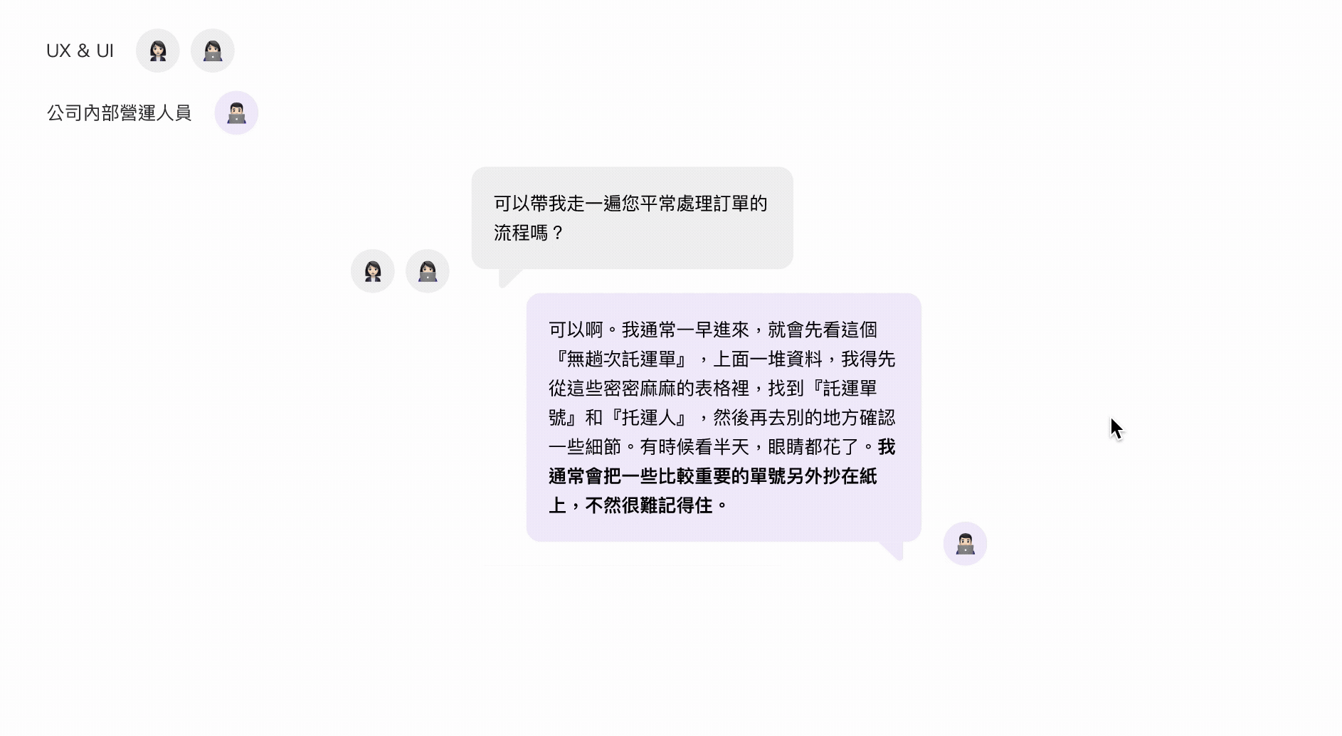
Every day, our carriers use the TMS to upload consignment notes for the following day. Upon receiving these requests, warehouse staff perform picking and packing based on the information provided in the system. As orders become ready for dispatch, our operations team manages delivery scheduling—assigning consignments to fleets and drivers based on the day’s current capacity.
Design Principles
Problem Diagnosis:
The initial diagnosis stemmed from requirement discussions with the PM, who shared feedback from internal operations and clients. The data indicated that dispatchers struggled to quickly grasp order statuses and process progress during daily operations. Through further deep-dive discussions, we identified that information was scattered across multiple screens, leading to low operational efficiency—a critical pain point affecting the actual workflow.
Problem Diagnosis & Design Insights
Problem 1
Information Overload
For a B2B Transport Management System, users must handle a high volume of orders and make scheduling decisions daily. The primary challenge is not a lack of features, but rather information overload and high decision-making costs. Working under intense time pressure, any error can directly impact delivery deadlines and operational costs. Therefore, the focus of the system design is clarity and stability, rather than a sense of exploration.
Demo Video For Dispatching Calendar Version
In another company project, we initially tried using a calendar design for the vehicle dispatching UI. This project utilized drag-and-drop functionality with the mouse for daily dispatch operations. Please refer to the video below.
However, for this current project, due to the inclusion of many more complex details in the dispatch content, we plan to redesign it using a table format.
Demo Video For Dispatching Calendar Version
During user interviews for the dispatching table redesign, we observed that the page's excessive complexity overwhelmed users. We found that users frequently lost track of their selections due to the high cognitive load, making dispatching tasks significantly more difficult. Furthermore, the existing UI components were no longer sufficient to meet current functional requirements.
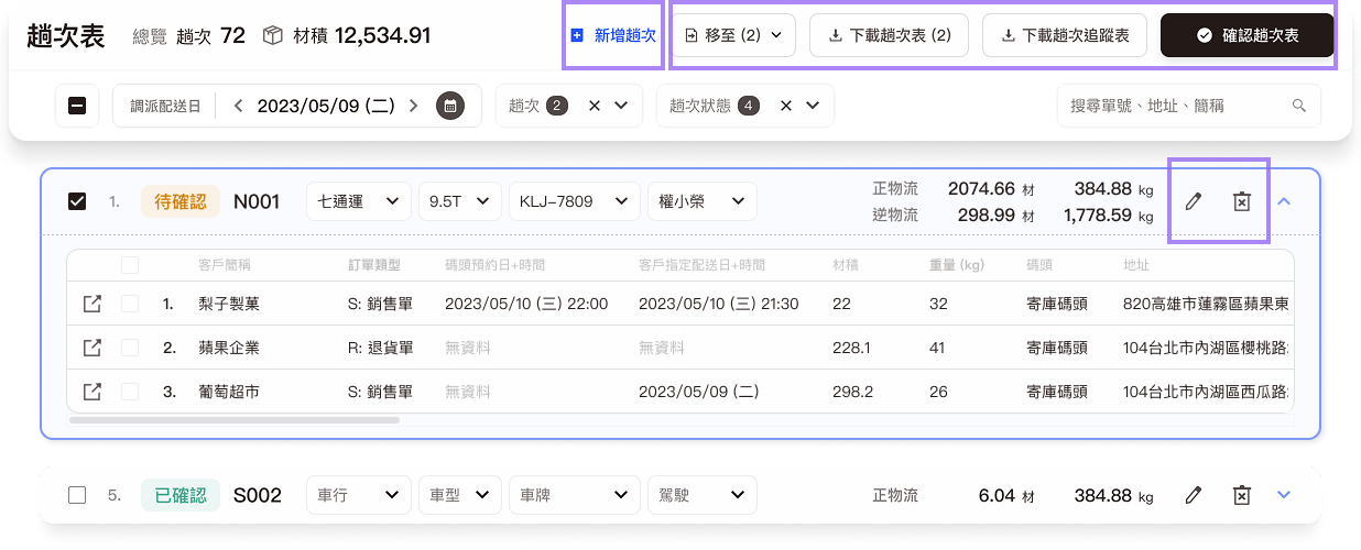
Solution 1
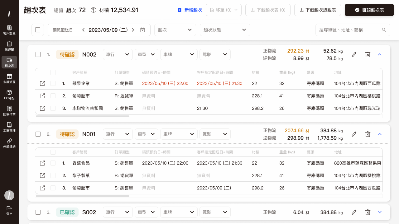
Structured Information for Improved Readability
We restructured the cluttered interface into a more organized table format, making the information clear at a glance.
Problem 2
Bad Readability: Complex Operations & Lack of Real-Time Feedback
1
Complex Operations & Lack of Real-Time Feedback
The old interface's tedious table selections and information overload made it difficult for users to quickly get the information they needed.
2
Dispersed Visual Cues
The tables used excessive color blocks to display status, which reduced the page's readability.
Solution 2
Simplify Flow & Enhance Information Visibility
1
Simplified Flow:
I simplified the operational flow to enhance the user experience and provided clear status feedback at every step of the process.
2
Optimized Visual Guidelines:
I redefined the overall UI color palette and iterated on the existing Design Guideline to ensure visual consistency across the product.I consolidated button hierarchy: We organized the button visual hierarchy to enable users to quickly and effortlessly locate the most critical actions within a complex interface.
1
Primary Actions: For the most crucial and frequently used tasks, such as "Add," "Download," or "Confirm," we enhanced visual prominence by combining icons with text. This ensures these buttons are instantly scannable, thereby boosting user operational efficiency.
2
Secondary Actions: For auxiliary functions that are context-specific or have low click frequency (e.g., "Edit" or "Delete"), we utilized pure text or pure icons. This approach significantly reduces visual clutter, contributing to a cleaner overall screen design.
3
System Maintenance: Concurrently with the redesign, I iterated and updated the Design Guideline by documenting specific button usage scenarios and design specifications, which successfully refined and completed the design system documentation.
3
Enhanced Information Visibility: To improve readability, I made the following design changes:
・Minimized the color range used for dispatch status and displayed it with small tags.
・Used shadows and gray backgrounds to clearly distinguish the information hierarchy.
Dispatching Page Table Version Before Redesign
介面缺乏視覺引導,容易讓使用者感到疲勞。
Solution 3
任務導向優化視覺層級,透過卡片式佈局與圖示設計,讓介面更具掃視性。
設計目標:優化視覺層級,透過卡片式佈局與圖示設計,讓介面更具掃視性。
透過資訊分流,將不同任務的資料分開,讓使用者能更專注於當前任務。
To streamline information by separating data for different tasks, allowing users to focus on their current work. We restructured the cluttered interface and presented it in a more organized table format, enabling users to quickly scan and filter information.
Outcomes
Design Outcomes & Team Impact:
By aligning requirements and feasibility with PMs and engineers early in the process, the final design significantly reduced back-and-forth clarifications and revisions during development. The reorganized interface empowers users to monitor order statuses more efficiently, enhancing the overall smoothness of daily dispatching and operational workflows.
1
User Feedback & Clarity: Users reported that the page information became significantly clearer, leading to a substantial improvement in the overall interface usability.
2
Usability & Efficiency: Through dedicated usability testing, we confirmed that the redesign effectively reduced the time required for users to complete a full dispatching task, simultaneously minimizing errors that could occur during the vehicle assignment process.
3
Scalability & Aesthetics: The post-redesign UI components demonstrated enhanced scalability and flexibility, allowing for easier adjustments to meet future feature requirements. Furthermore, the simplified UI color palette led to a much cleaner and clearer visual presentation.
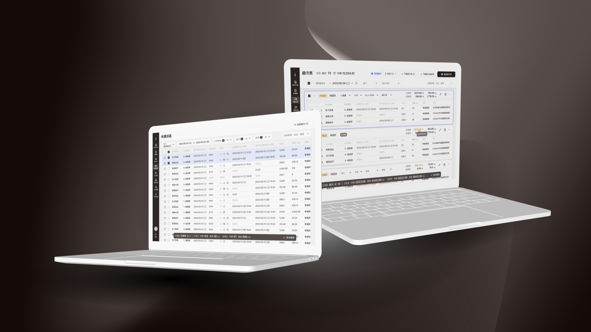
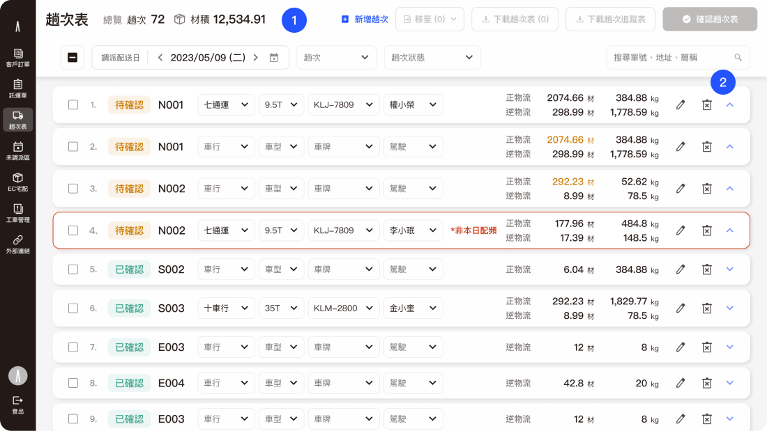
TMS UI design
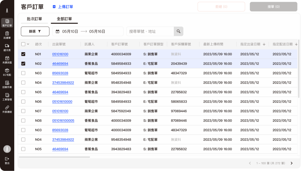
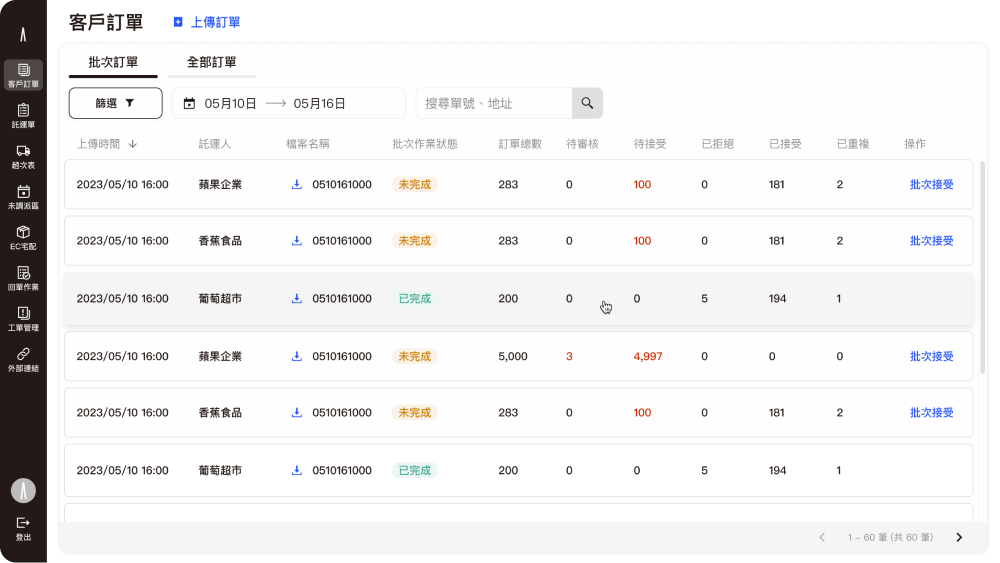
Delivery status at a glance
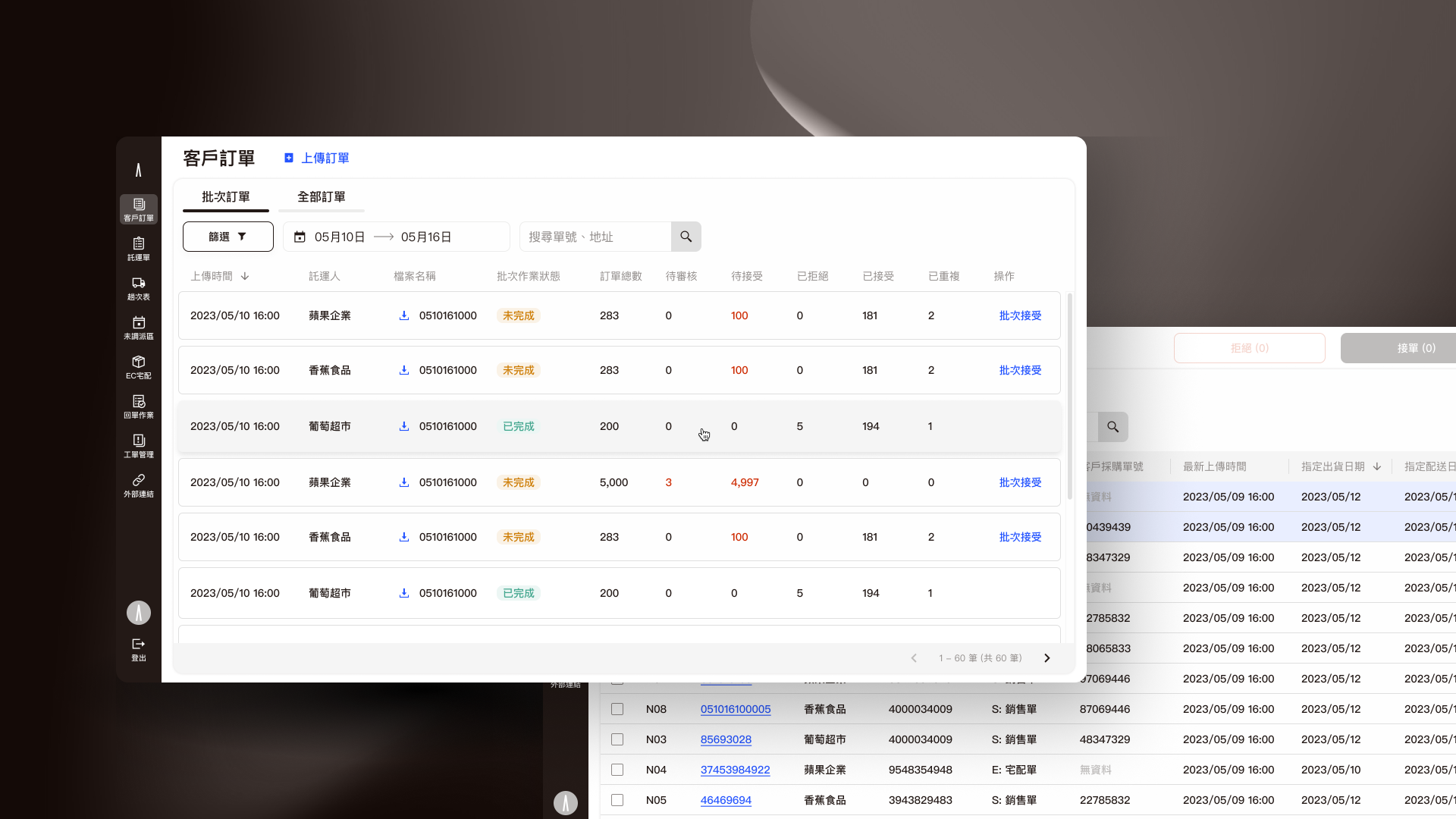
Shipment order list UI
Table view
Cross-platform order tracking is provided to keep track of transportation status anytime, anywhere.
List view
We design different views depending on data types.
1
Time picker is important for shipments, so we use it as a main filter.
2
Display the filter with a toggle button and use multiple selectors at a glance.
3
CTA buttons are enabled depending on the selected item, and we place them in the upper right corner of the screen.
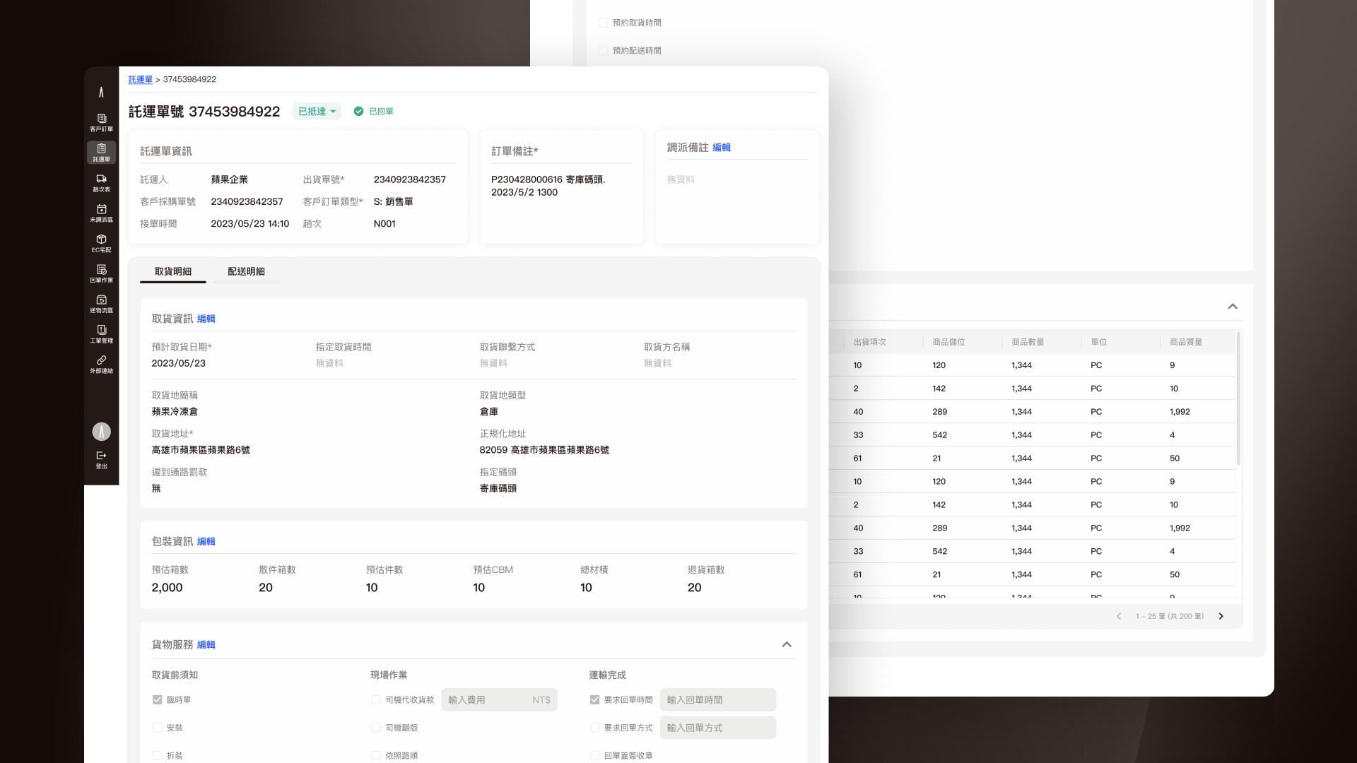
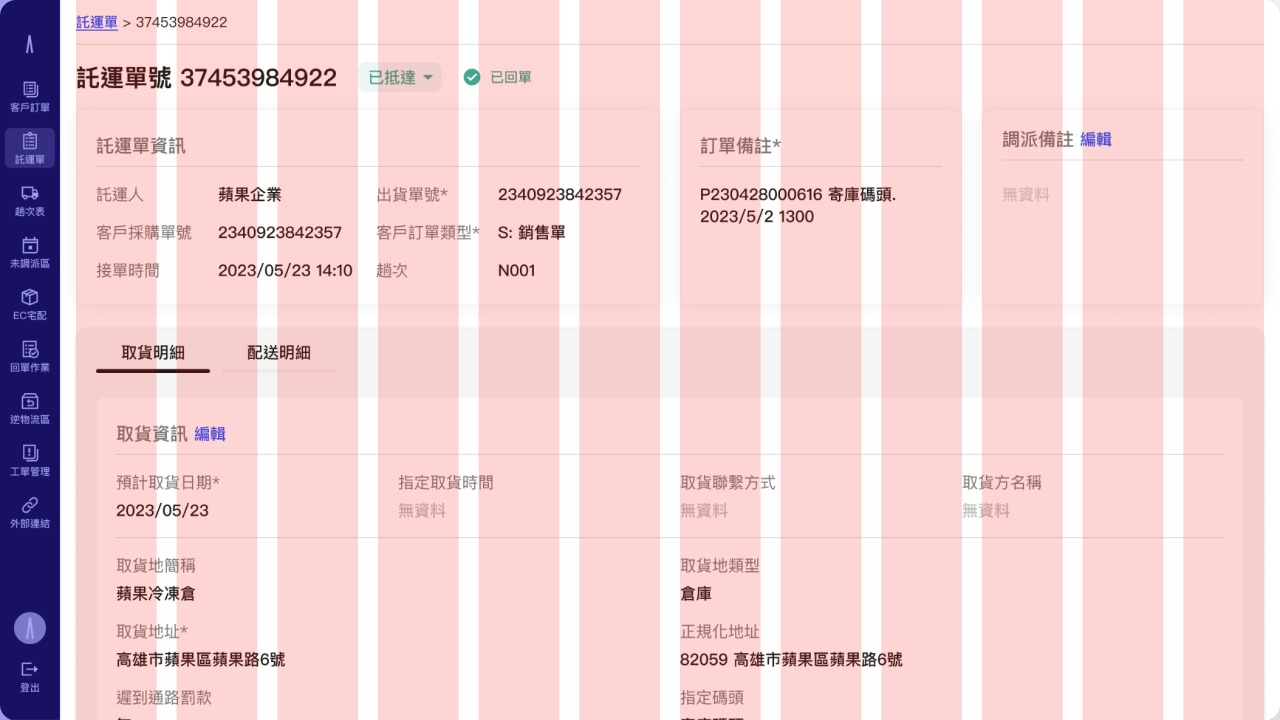
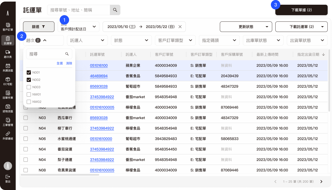
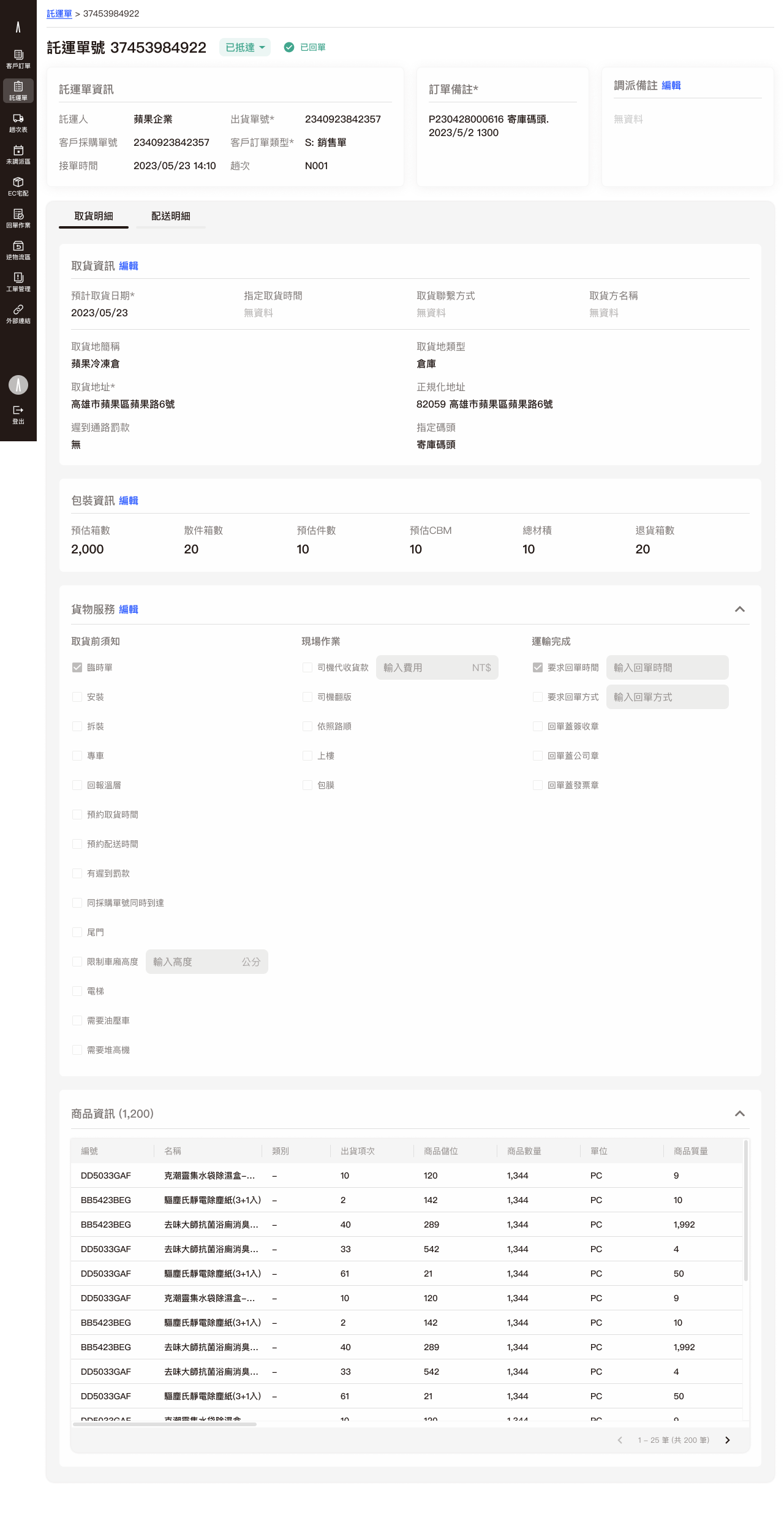
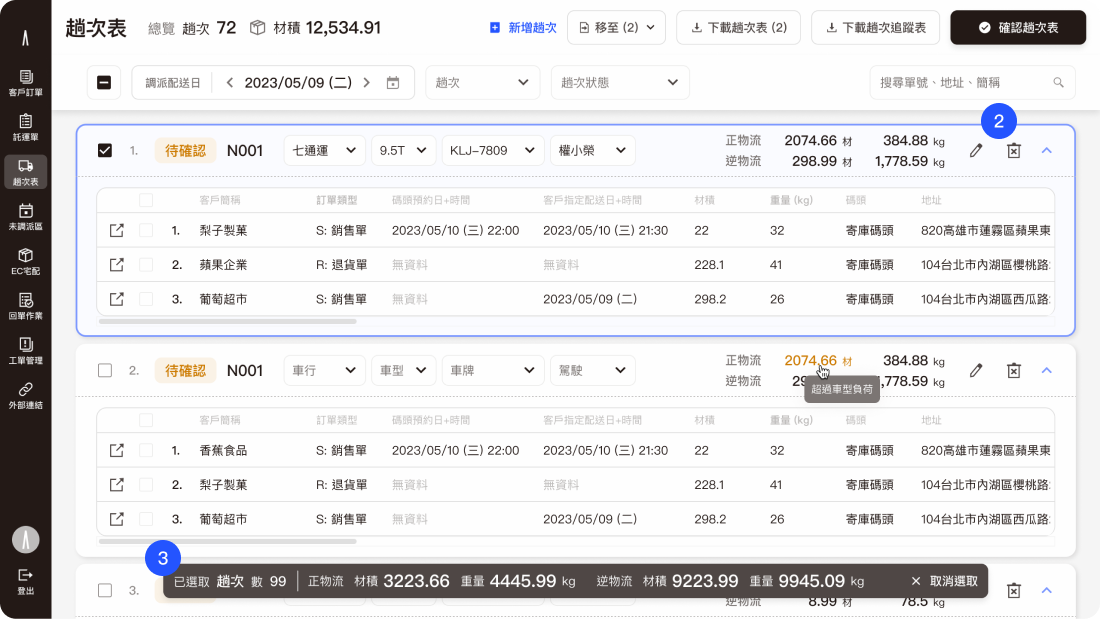
Order Shipment Detail Page
Transport Dispatch Platform
Integrate transport capacity of various carriers to improve vehicle utilization.
User Journey
Demo Video
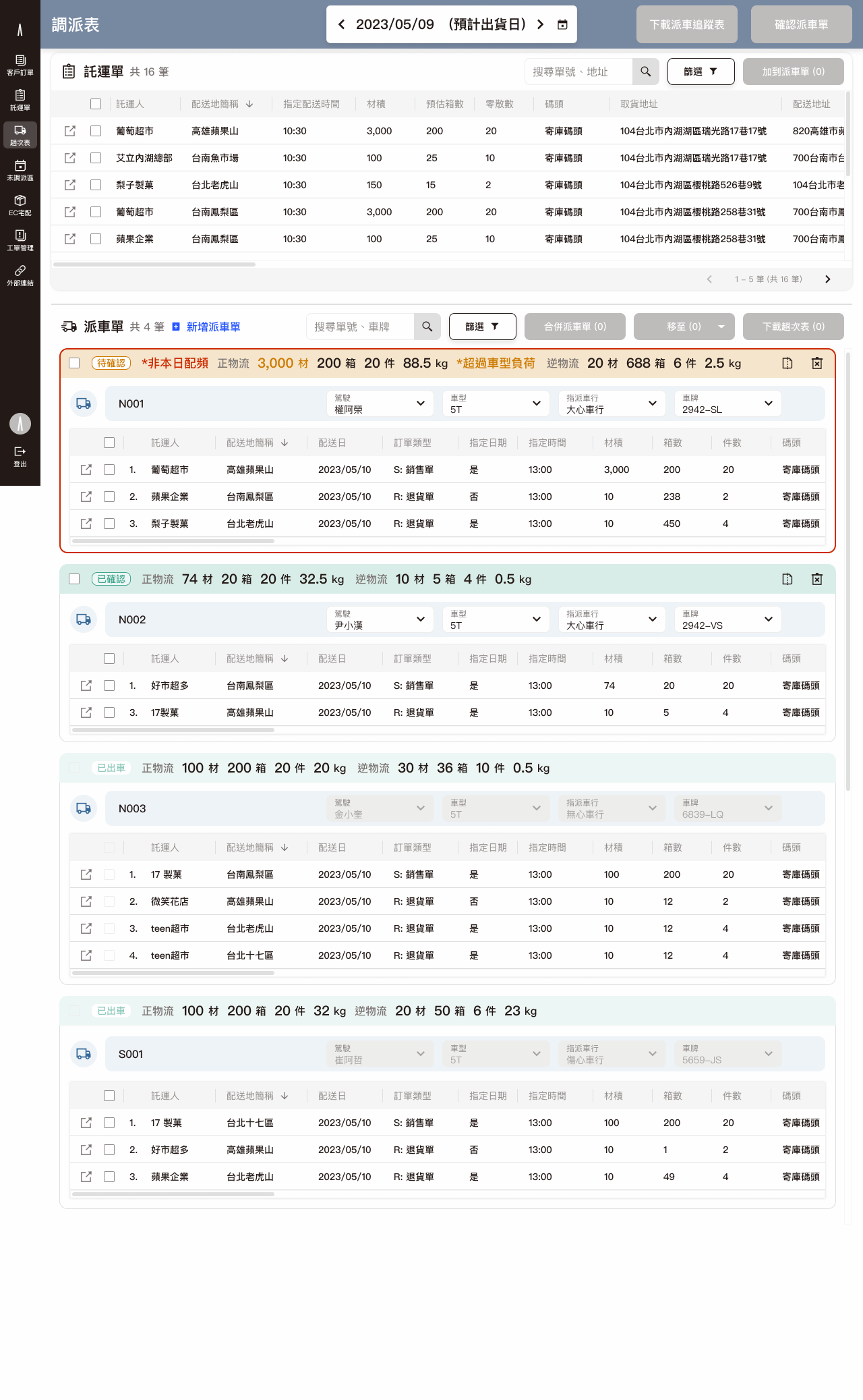
Dispatching workspace for shipments
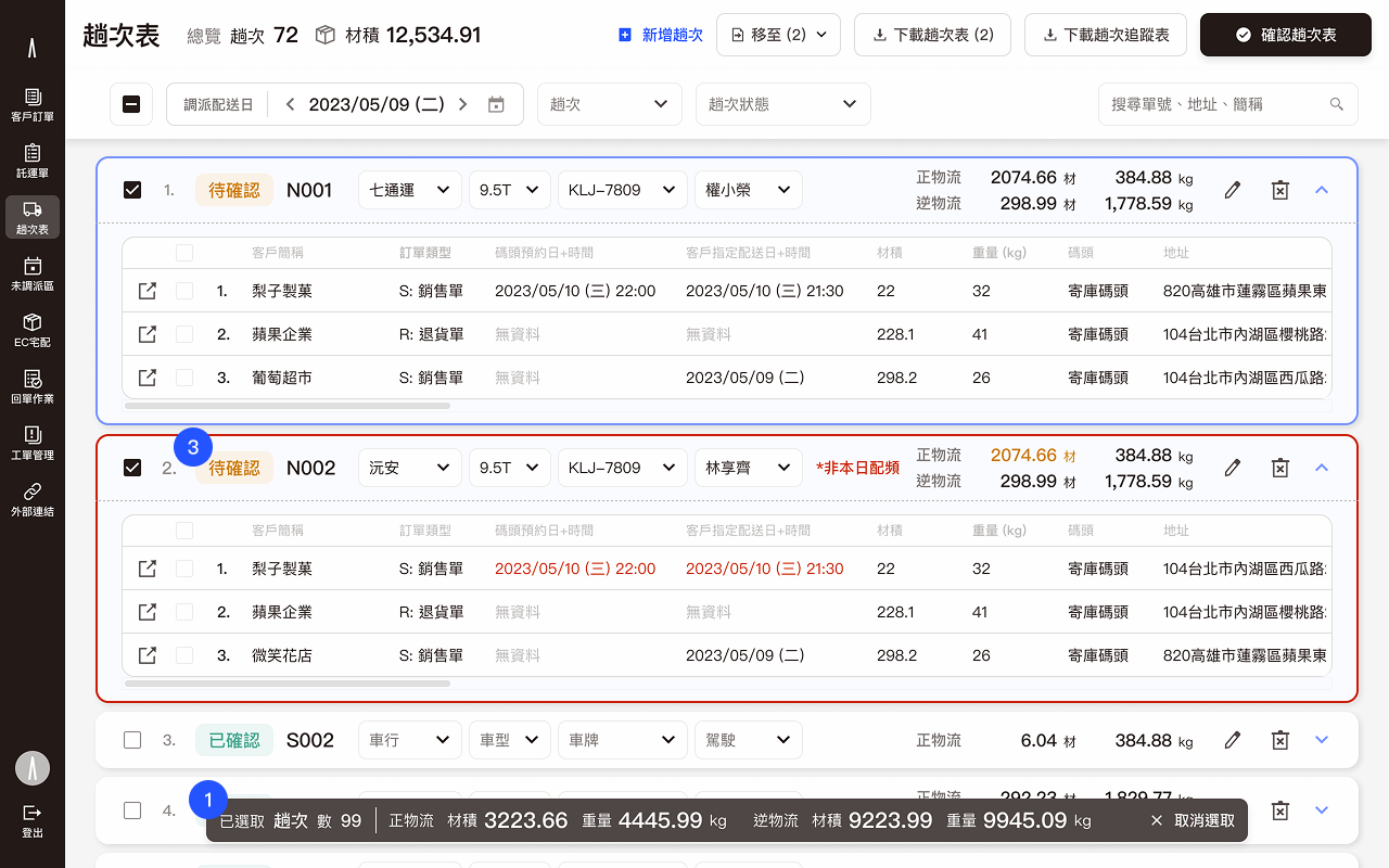
1
Fixed header and fliter for overview.
2
Expandable item; by default, it is in a closed state to reduce visual fatigue due to the abundance of data in the dispatching workspace.
3
Show the selected item summary.
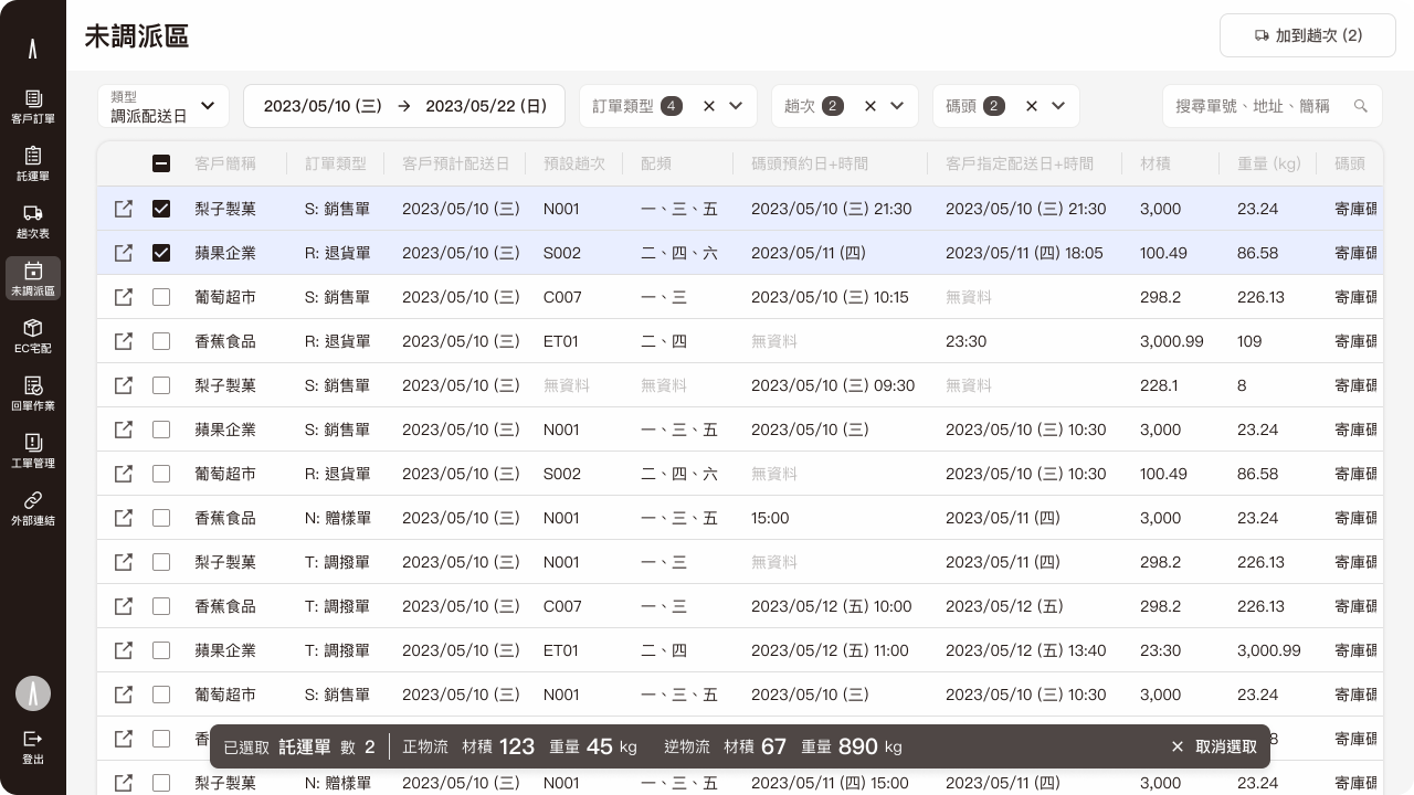
Not dispatched shipments workspace
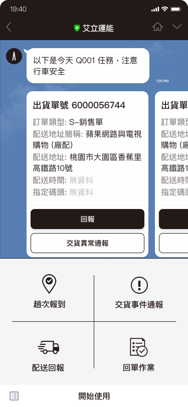
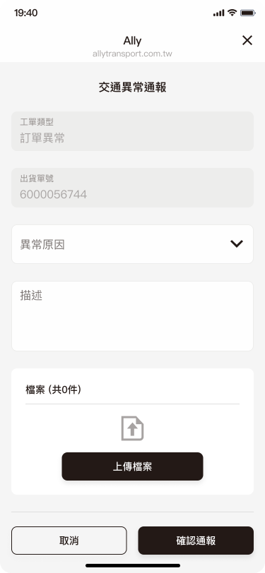
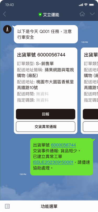
Driver report system
We have decided to use the Line app for drivers to accept orders and report their status. Almost every driver already uses Line, which means our drivers won't have to download any additional apps. Furthermore, drivers are already highly familiar with how to operate Line.
Ally transport LINE drivers report system