Renta e-books Keywords Search and e-Bookshelf filter Redesign

To make it more convenient for users to search for and read books, we have implemented two UI redesigns.

1. Renta e-books Keywords Search Redesign

2021
Duration

Search result filter: 1 month

Search bar redesign: 2 weeks

My Role

UI designer

Responsibility

UI/UX design

Product

E-book website

Story

My Role:
I served as the UI/UX Designer for the search experience redesign of Renta!, an e-book rental platform. I collaborated closely with frontend/backend engineers and key stakeholders to optimize user search behavior and conversion funnels. My primary responsibility was to translate user needs and business objectives into actionable search workflows and interface designs, while maintaining continuous alignment with stakeholders on priorities and product direction.
Why are we doing a redesign?
For User Experience
Simplify the processes.

➡ Simplify the processes of searching, reading, and purchasing books, improving the overall user experience.

For Technical Structure
Overcome the technical limitations of the current product.

➡ Planning to modularize website UI components, separate front-end and back-end programming, and make it responsive for increased site maintenance and usability.

Before And After

Google Analytics Comparison for Search

(Year-over-Year Comparison)

Search after Redesign:
Search bar use rate

increased 9.52% ↑

Refinement rate

decreased 17.70%↓

Search results pageviews

increased 23.60%↑

Study

Problem Diagnosis:
The initiative began with discussions with the marketing team, who noted that while the platform maintained stable traffic, the conversion rate from search results remained suboptimal. Upon deeper analysis, we discovered that after performing a keyword search, users struggled to quickly determine if a book met their needs. This friction led to high bounce rates or repetitive keyword modifications.
1
I use Hotjar, a heatmap tool, to analyze user behavior.
2
I analyzed the existing Google Analytics report data to guide the redesign.
heatmap for PC before – mouseclick

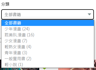
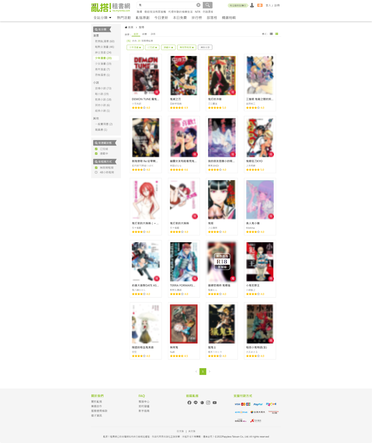
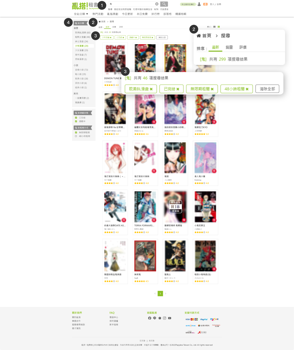
The primary behavior of users is to search directly using keywords. Therefore, the UI has been redesigned to remove the category search dropdown.

persona

Based on audience data from Google Analytics and Google Ads on the Renta website, I identified that our primary users are women aged 18–44. I used this core demographic as the foundation for building Personas, and combined it with common browsing and search behaviors on the platform to define representative user roles. This approach helps ensure that subsequent UX flows closely reflect real usage scenarios.

Persona 1 — Leisure Commuter Reader
Anna Lin
25 years old |office worker
Lifestyle & Behavioral Traits
1
Enjoys “killing time and relaxing” during commuting or lunch breaks; tends to use a phone or tablet after work and prefers to unwind at night.
2
Has limited data and storage; does not want to download large files and prefers online reading over downloads.
3
Occasionally saves a “to-read list” and likes casually picking the next title to read.
Goals

Wants to quickly find something to read during commuting or break times, be able to search for suitable titles anytime and anywhere, and avoid spending too much time deciding.

Pain Points
1
Search results can be overwhelming and poorly organized, making it hard to quickly find desired content.
2
Detail pages contain too much information → inconvenient to scroll through on mobile.
3
If the purchase or rental process is too complicated, it negatively affects the overall experience.
Values / Motivations
1
Seeks a reading experience that is fast, effortless, and convenient.
2
Wants to minimize the time cost of hesitation, waiting, and complex processes.
Persona 2 — Avid Reader & Collector
Mei-Chun Wu
19 years old | New to the workforce
Lifestyle & Behavioral Traits
1
Curious and eager to explore different genres (manga / light novels / romance).
2
Prefers visually appealing books with eye-catching covers; easily influenced by recommendations or covers, and often decides whether to continue reading based on the cover and a short description.
3
Occasionally browses social media on her phone; discovers book lists through friends or social platforms → looks for beginner-friendly titles. Reading time is irregular—sometimes before bed, sometimes during free moments.
Goals

Wants to find beginner-friendly, easy-to-start books (diverse genres, attractive covers, affordable prices), and hopes to rely on recommendation systems, trending lists, and rankings to make quick decisions.

Pain Points
1
If the homepage or search interface feels too professional or information-heavy → she becomes confused and loses interest.
2
Without clear labels such as “Beginner-friendly,” “Recommendation Score,” or “Reader Reviews,” it is hard for her to decide.
3
If the UI is not intuitive or user-friendly → she is likely to give up.
Values / Motivations
1
Enjoys reading content that feels light, fun, trendy, and contemporary.
2
Wants to quickly grasp key information (cover / synopsis / reviews) → decide immediately whether to rent and read.
3
Price-sensitive; expects a simple rental mechanism and transparent pricing.

Design

Design Process & Collaboration:
Before redesigning the search flow, I mapped out the complete user journey from "entering a keyword" to "purchasing a book." I consulted with marketing and engineering teams to identify which information should be prioritized to lower the user's decision-making cost. During workflow discussions, we made several strategic trade-offs regarding search result ranking and the display of filter criteria, aiming for a balance between information density and cognitive load.

Step by step

Phase 1 - redesign the search results page

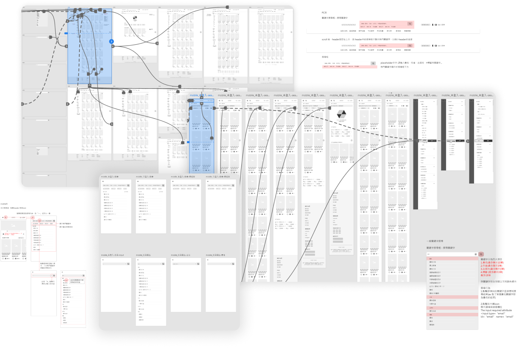
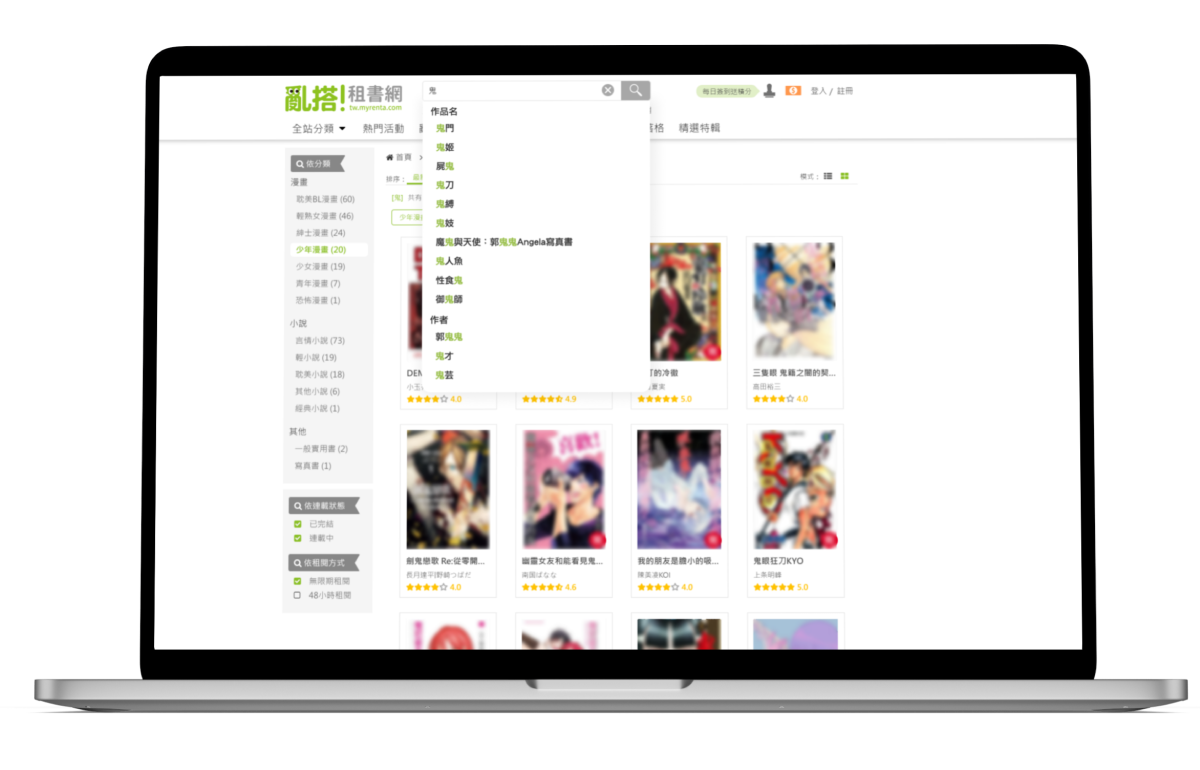
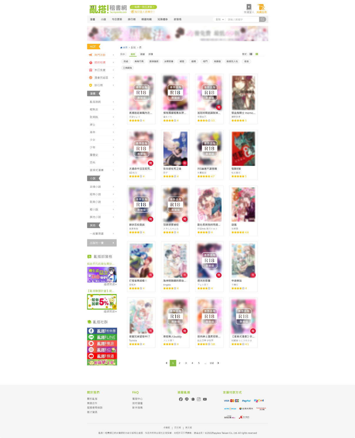
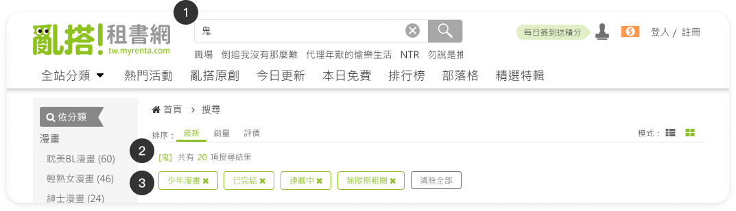
Before redesigning the search bar, we plan to redesign the search results page. For example, we removed the original sidebar and added the advanced filter to make the search easier and more efficient.

Phase 2 - redesign the search Bar

Redesigning the search function helps lower the search level for users in the purchasing process. Additionally, we added popular keywords to assist in marketing and promoting popular books.

Phase 1
Phase 2

Redesign UI

Once the initial interface was completed, I worked with the marketing team to audit the information hierarchy of the Search Engine Results Page (SERP). We adjusted the layout based on potential user decision scenarios. For instance, we prioritized key book metadata and de-emphasized distracting elements, empowering users to more efficiently decide whether to view details or proceed with a purchase.

search bar for PC

Demo video
Before
After
After the redesign, readability and usability were improved, and system status visibility was enhanced.A new “Clear” button was added.
1
Add a "Clear" icon button:
2
Autocomplete keywords:
Suggested keywords are displayed within the menu and categorized according to the original search bar options: Book Title, Tags, Author, and Publisher.
How did I determine the order of the suggested keywords?
The ranking and categorization of suggested keywords were determined based on search data from the past six months, sorting keywords by the percentage share of searches for book titles, authors, tags, and publishers among all search queries.
3
Displaying trending keywords to drive business opportunities and conversion rates.
Trending keywords are displayed below the search bar based on Google Analytics site search data.
4
Search bar loading status:
5
"No results found" state:

search bar for mobile

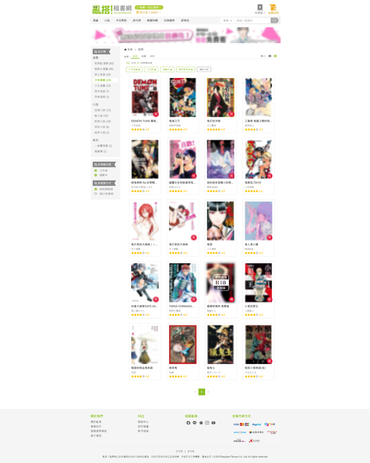
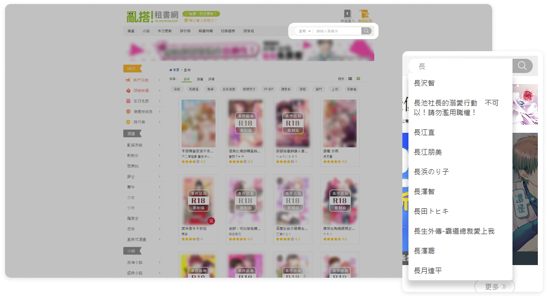
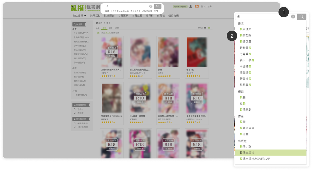
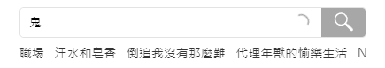
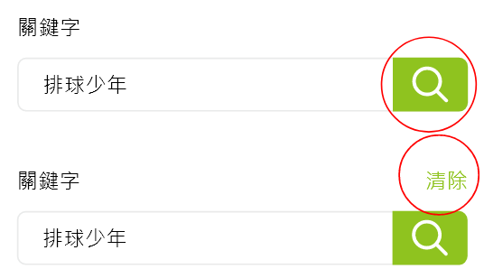
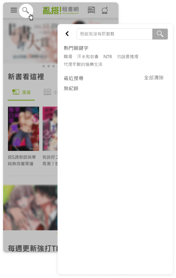
The search bar has been expanded to full-width, and the display of category items has been removed. Popular keywords are now shown below the search bar, and the recent search history is displayed. Additionally, we've added a 'Clear' icon button.

Before
After

Searching status for mobile

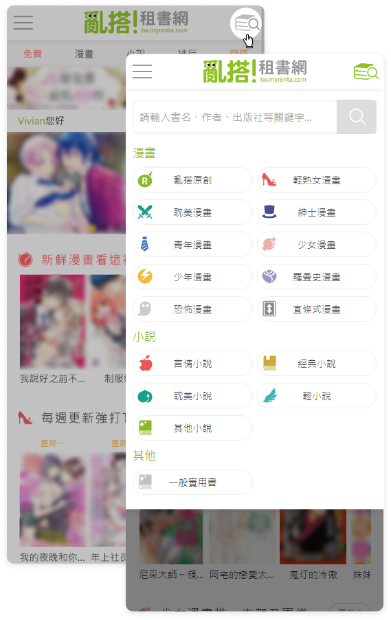
Before the redesign, the original suggested keyword menu was redundantly overlaid on top of the interface. Therefore, we simplified the UI to make it clearer.

Before
Searching status
After
Searching status
Searched status

search Results page for PC

Before
After
1
Retain the keyword search content in the search bar.
2
Show the number of results for the keyword search.
3
Filter tags list:
Show the selected filtering conditions above the results, and allow clearing the filters with a single click.
  • Book Title (display up to 10 items)
  • Author (display up to 3 items)
  • Publisher (display up to 3 items)
  • Tags (display up to 3 items)
Before
Sidebar menu
After
Advanced filter function menu
4
Search Results Page Sidebar menu:
Align with the new version's header and footer, remove the old left sidebar structure, and replace it with an advanced filtering function list.

Show a dynamic menu based on the results, showing filtering conditions for book results that match the keywords.
4.1
Top Category Filter (Single Select):
Show category names and the number of books.
Arrange the new menu category order based on profit share and main promotion category.
4.2
Bottom Multi-Condition Menu (Multiple Select):
In checkbox form, expandable to accommodate future additional filter checkboxes.

On the desktop version, a single click on the filtering item will execute the operation.

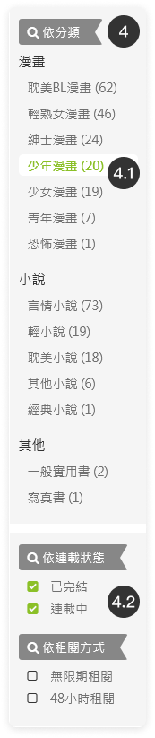
In the absence of search results, display the brand mascot along with a text prompt.

search Results page for mobile

Before
Search results
After
Search results
After filtering
1
Show the number of search results for keywords.
2
Show category filter menu expand button.
Click to expand the menu.
3
Show the selected filtering conditions above the results, and allow clearing the filters with a single click.
After
Searching status
Searching status
4
Advanced filter function menu:
Show a dynamic menu based on the results, showing the filtering conditions of books that match the keywords.
5
Fixed button below the menu:
After selecting options in the mobile menu, press "Apply" to execute the filter.Clicking "Clear" and then pressing "Apply" will execute the clear filter.

2. Renta e-Bookshelf page Redesign

2021
Duration

3 weeks

My Role

UI designer

Responsibility

UI/UX design

Product

E-book website

Story

Why are we doing a redesign?
For Retention Rate
Enhance retention rate of existing members.

➡ Increase return visits of existing members through new book release notifications for purchased books.
➡ Improve book purchasing rate by notifying members about new releases of books they have added to their favorites.

For member engagement
Increase the usability of the bookshelf to enhance member engagement.

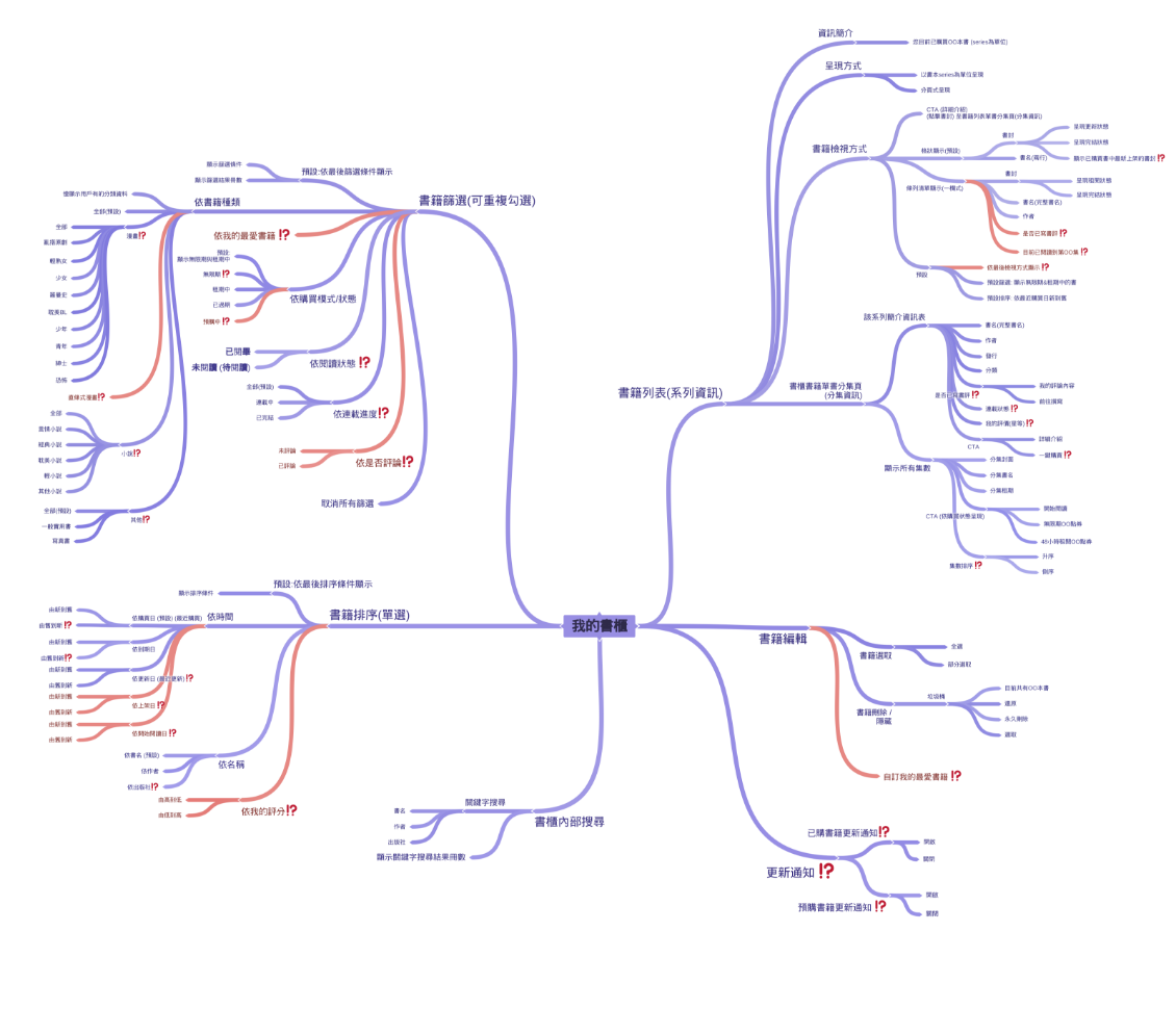
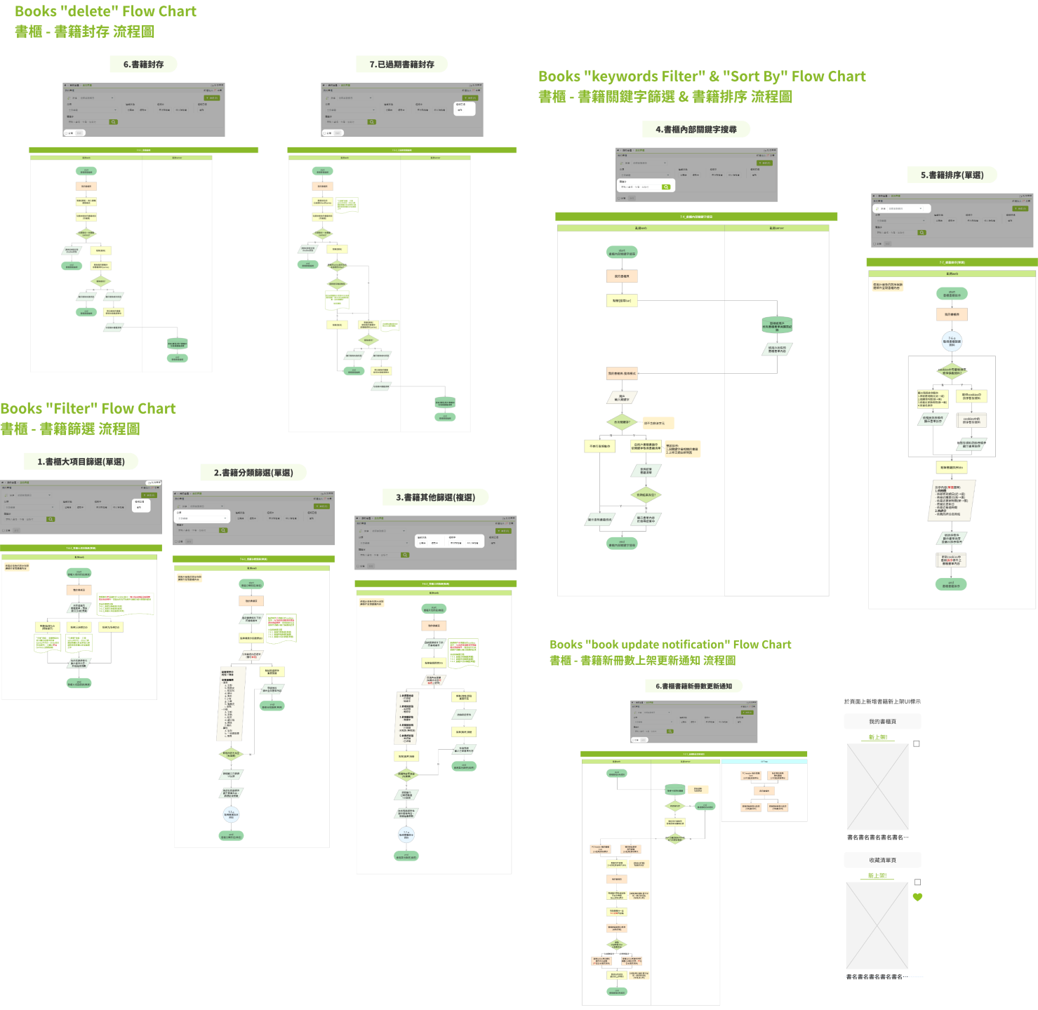
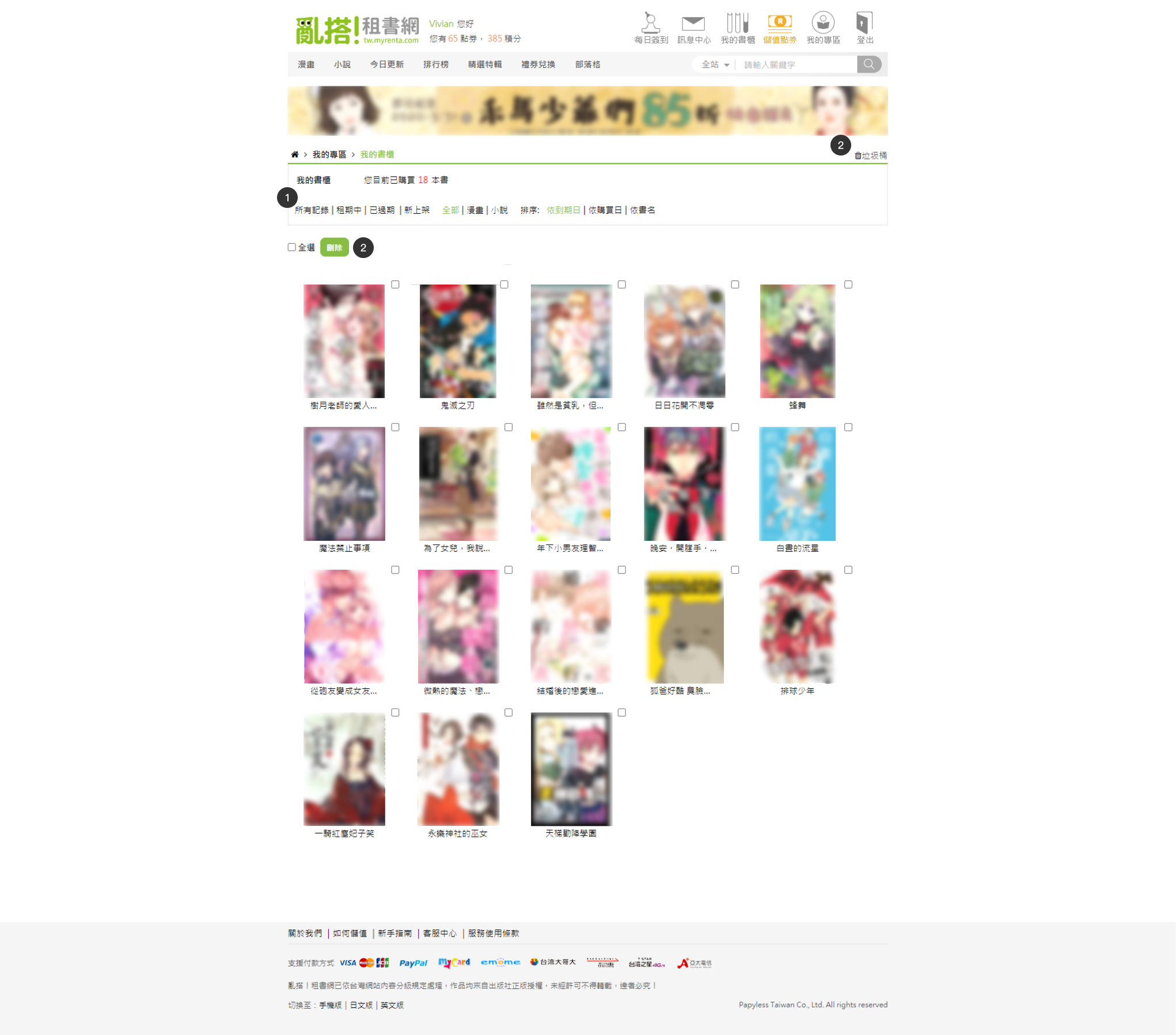
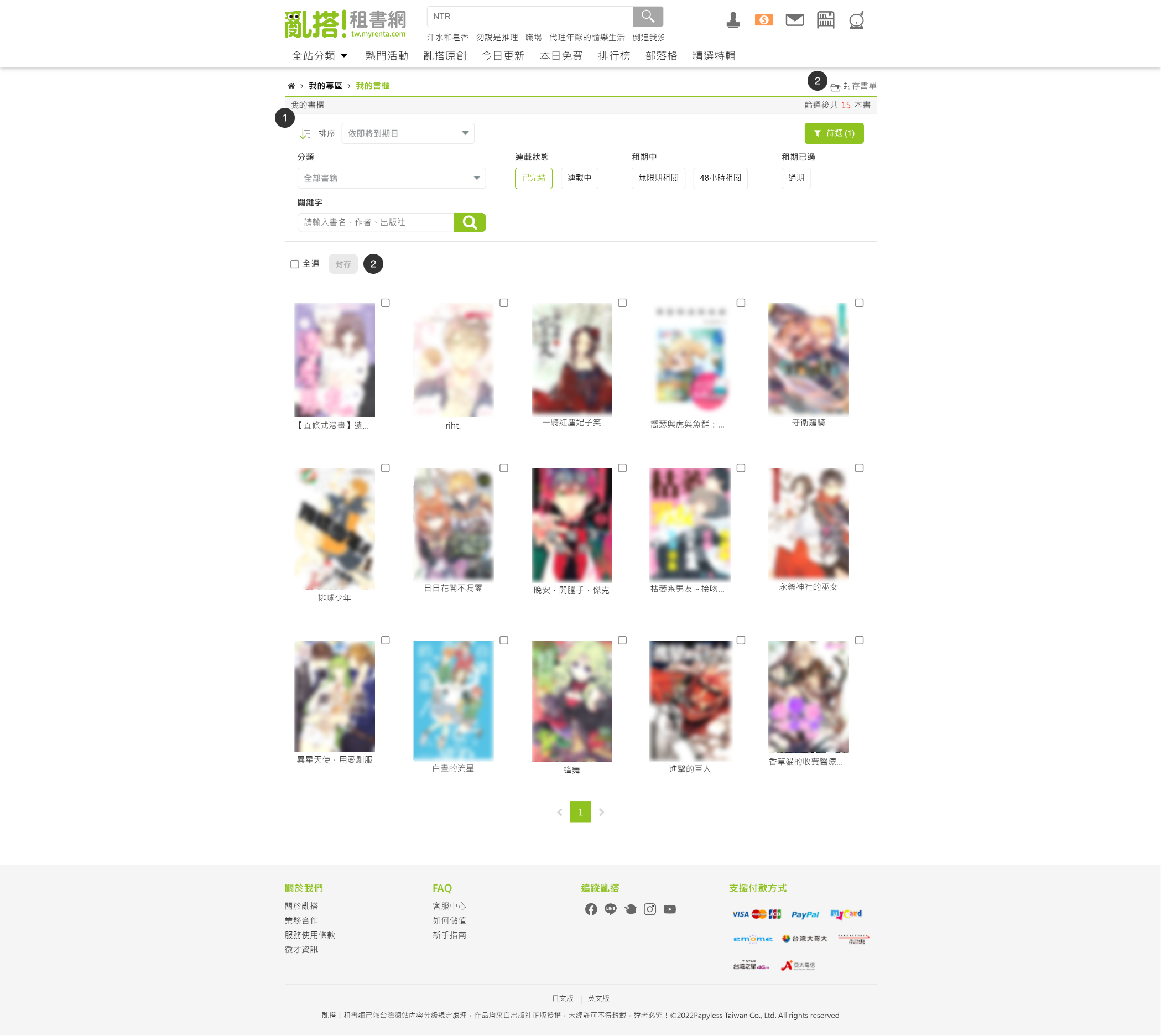
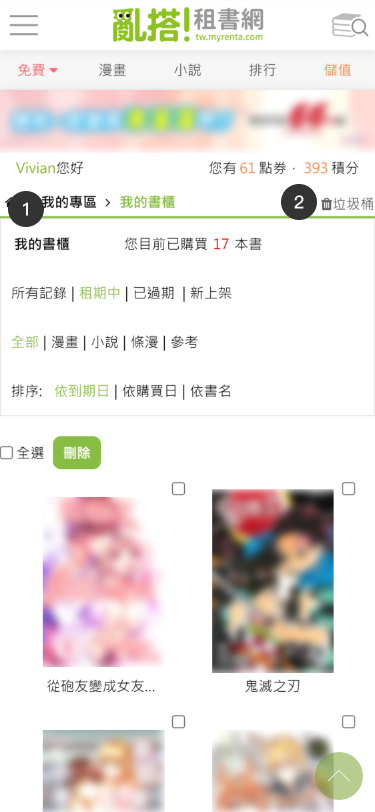
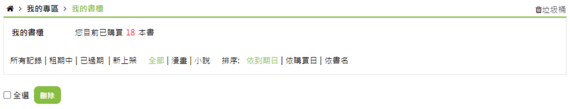
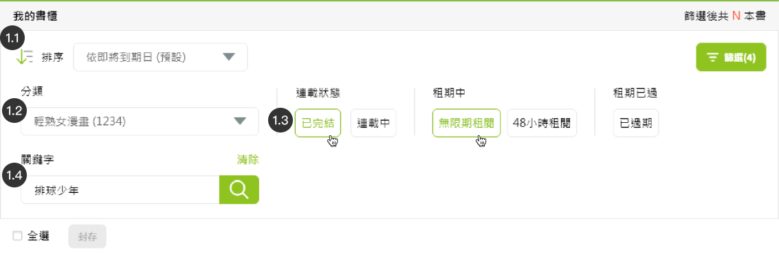
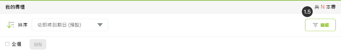
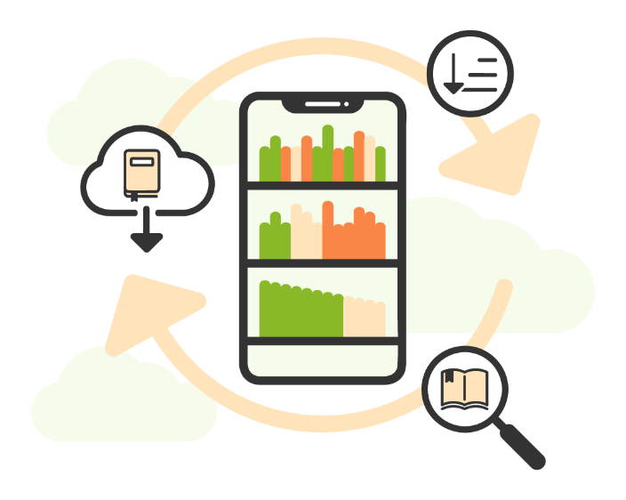
➡ Make the bookshelf more convenient for readers to find, organize, and read books.
➡ Make the favorites list more convenient for readers to find books.

Before And After

Google Analytics Comparison for Shelf

(Year-over-Year Comparison)

The new book notification mechanism in the bookshelf after redesign:
Average time that visitors spend on shelf page

increased 10.79%↑

Unique pageviews

increased 21.82%↑

The redesign of sorting, filtering, and keyword search functions after redesign:
Average time that visitors spend on shelf page

increased 12.25%↑

Page value

increased 3.90%↑

Study

Publish a Survey on Social Media

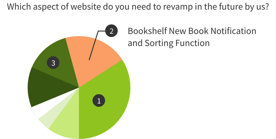
Investigate which website features users hope to see redesigned in the future.
The data indicates that the "Bookshelf" feature is the second most anticipated redesign by users:

  • New book release notification function
  • Optimization of the bookshelf sorting and filtering functions
  • Analyze the UI of other competitors.

Persona

Based on audience data from Google Analytics and Google Ads on the Renta website, I identified that our primary users are women aged 18–44. Using this core demographic as the foundation for persona development, I combined it with common browsing and search behaviors on the platform to define representative user profiles, ensuring that subsequent UX flows more closely reflect real-world usage scenarios.

Persona 1 — Avid Reader & Collector
Yuna Chen
34 years old |woman
Lifestyle & Behavioral Traits
1
Established reading habits: rents and collects multiple books every month.
2
Enjoys deep reading, collecting, and revisiting book content repeatedly.
3
Not only rents books but also frequently saves them to “My Bookshelf” for reading list management; organizes collections by style, genre, publisher, and author.
Goals

Wants to maintain personal reading lists and bookshelf collection habits, while expecting powerful collection and categorization features with an easy-to-manage interface. Values convenient search and filtering, and prefers clear book covers, detailed information, category tags, and reading history records.

Pain Points
1
Existing bookshelf interface / management system is not user-friendly → difficult to manage and locate books as the collection grows.
2
Search and filtering features are not granular or intuitive enough → hard to quickly find books for rereading or recommendation.
3
Unclear UI or poor layout → causes visual fatigue during prolonged use.
Values / Motivations
1
Views reading as a long-term lifestyle habit, not merely a way to pass time.
2
Appreciates an organized, collectible, and aesthetically pleasing reading and curation experience.

Design

functional map

Flow chart

Redesign UI

e-Bookshelf page

Demo video for PC
Before
After
Before
After
1
Add collapsible advanced filters and new sorting options:
Advanced filters:
  • Keyword filter
  • Category filter (single select)
  • Other condition filters (multi-select)
2
Change the term "Trash" to "Archive Booklist" to better match the characteristics of e-book products.
Change the [Delete] button to an [Archive] button. When not selected in the front end, it should be in an unclickable state, prompting users for action.
Before
After
Advanced filters opened (default):
Advanced filters closed:
1.1
Add new sorting options:
  • By expiration date (near to far)
  • By recent purchase date (new to old)
  • By recent update date (new to old)
  • By book title.
  • By author name
  • By publisher
1.2
Add collapsible advanced filters
  • Category filter (single select):
    Use a dropdown menu to display the categories of books purchased by the member along with the count of books in each category.
  • Other condition filters (multi-select)
  • Keyword filter
1.3
Redesign the original filter text button
Redesign the original filter text button to an outlined button for easier clicking.
1.4
Keyword filter input form:
In input state, the keyword filter is executed by pressing the search icon. After the filter is applied, a "Clear" text button is displayed, allowing users to clear the keyword filter by clicking it.
1.5
The menu is designed to be collapsible
The menu is designed to be collapsible; when clicking the "Filter" button, if the filter is applied, the button displays the number of currently filtered items, and the menu shows the total number of books.
亂搭!租書網已依台灣網站內容分級規定處理,作品均來自出版社正版授權,未經許可不得轉載,違者必究!
©2022Papyless Taiwan Co., Ltd. All rights reserved
← Prev projectNext project →

Get in touch

I am open to new jobs and new projects !