Simplify the processes.
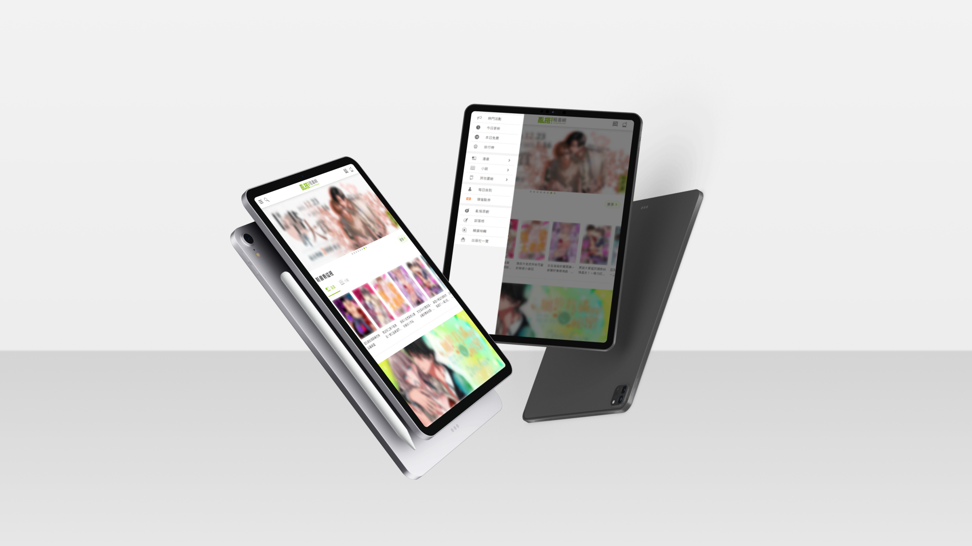
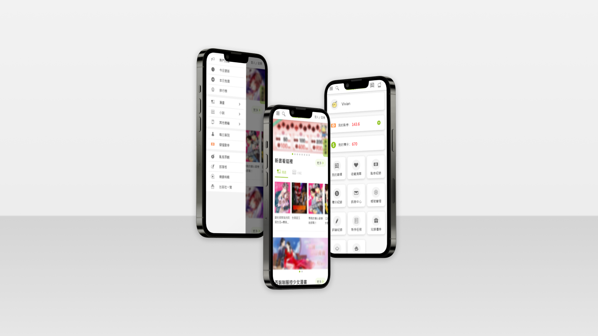
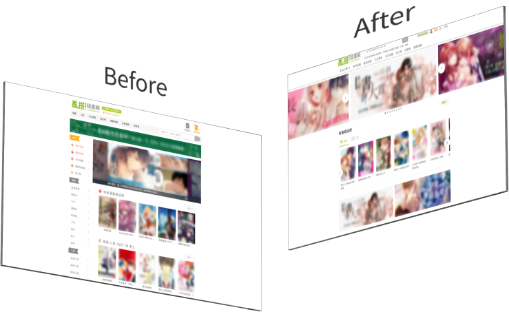
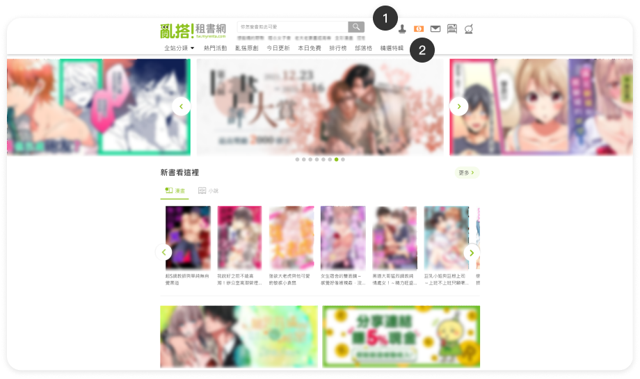
➡ Simplify the processes of searching, reading, and purchasing books, improving the overall user experience.

A year
UI designer
UI/UX design
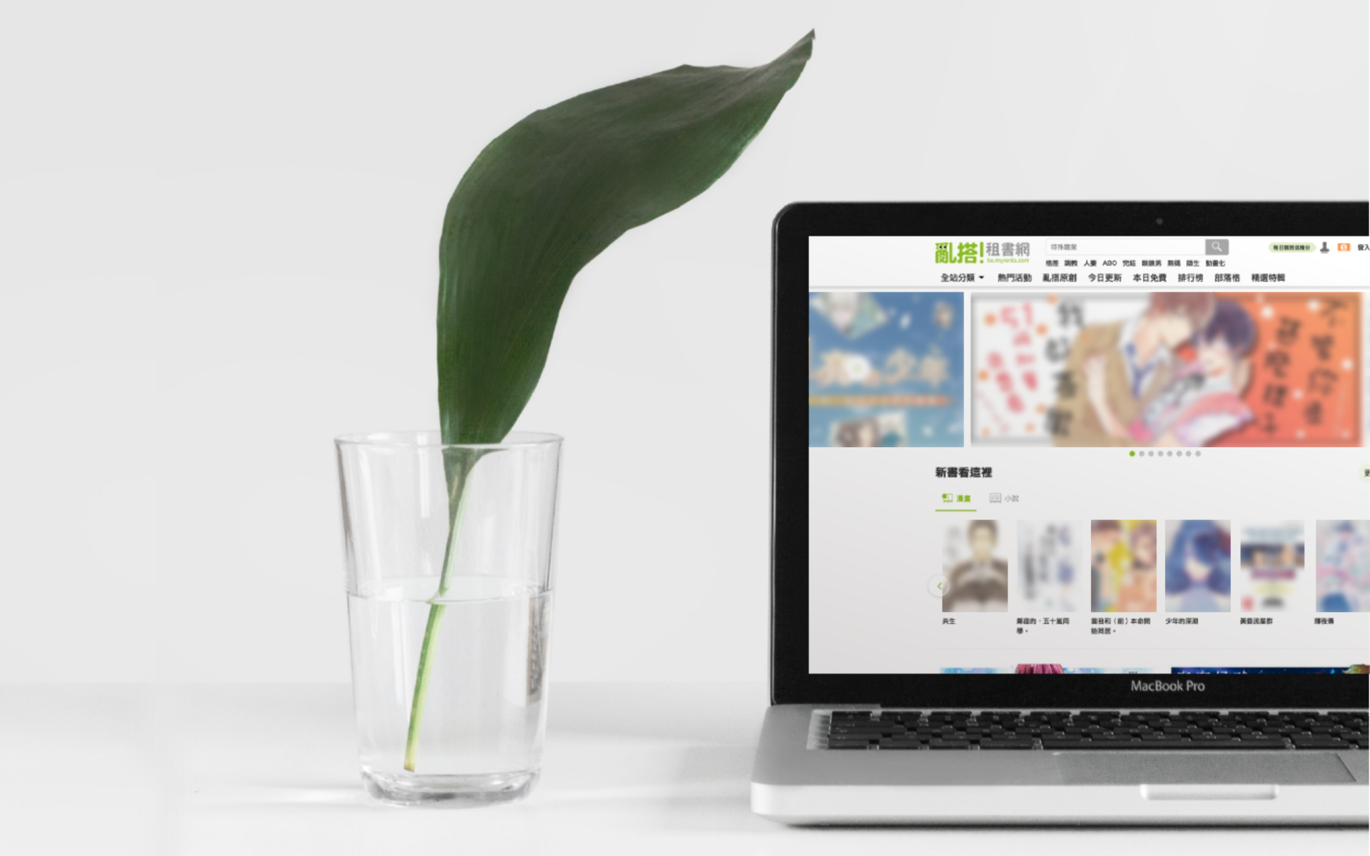
E-book website

➡ Simplify the processes of searching, reading, and purchasing books, improving the overall user experience.
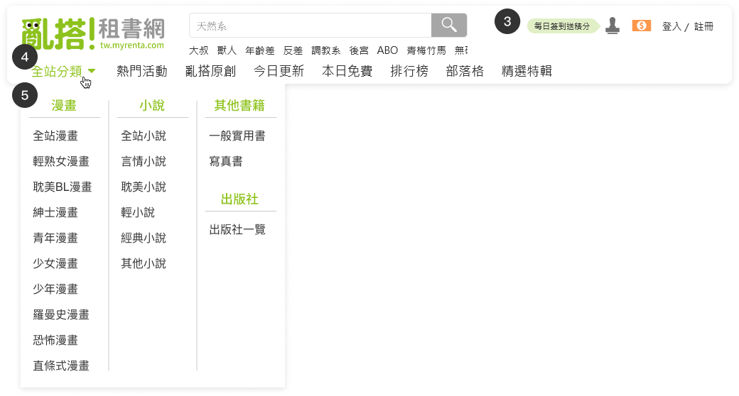
➡ Planning to modularize website UI components, separate front-end and back-end programming, and make it responsive for increased site maintenance and usability.
➡ Planning to revamp the points system to one decimal place, making product prices equivalent to Taiwanese units (0.1 point = 1 NTD), and redesigning the marketing public page.
➡ The old version of the website content no longer aligns with the current brand image. Planning a redesign for footer service content, the About Us page, and the Terms of Service page.
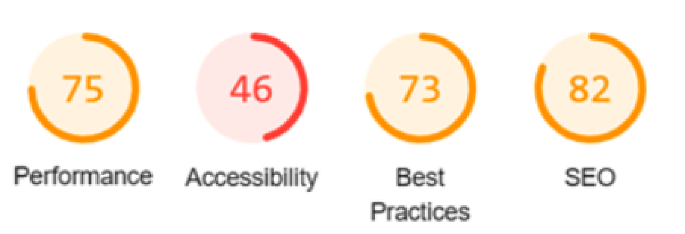
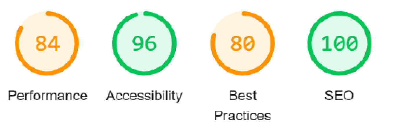
*Google Lighthouse metrics offer key insights into website quality by focusing on performance, accessibility, and SEO.It provides comprehensive audits, identifying technical areas for improvement.
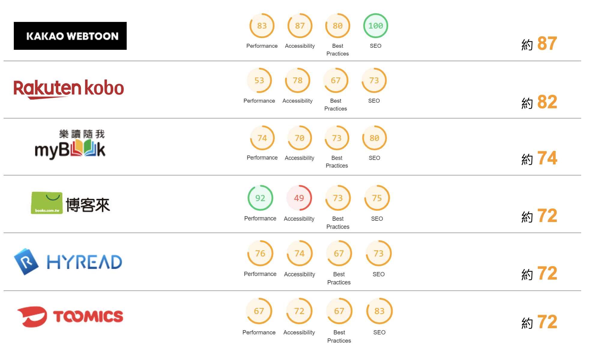
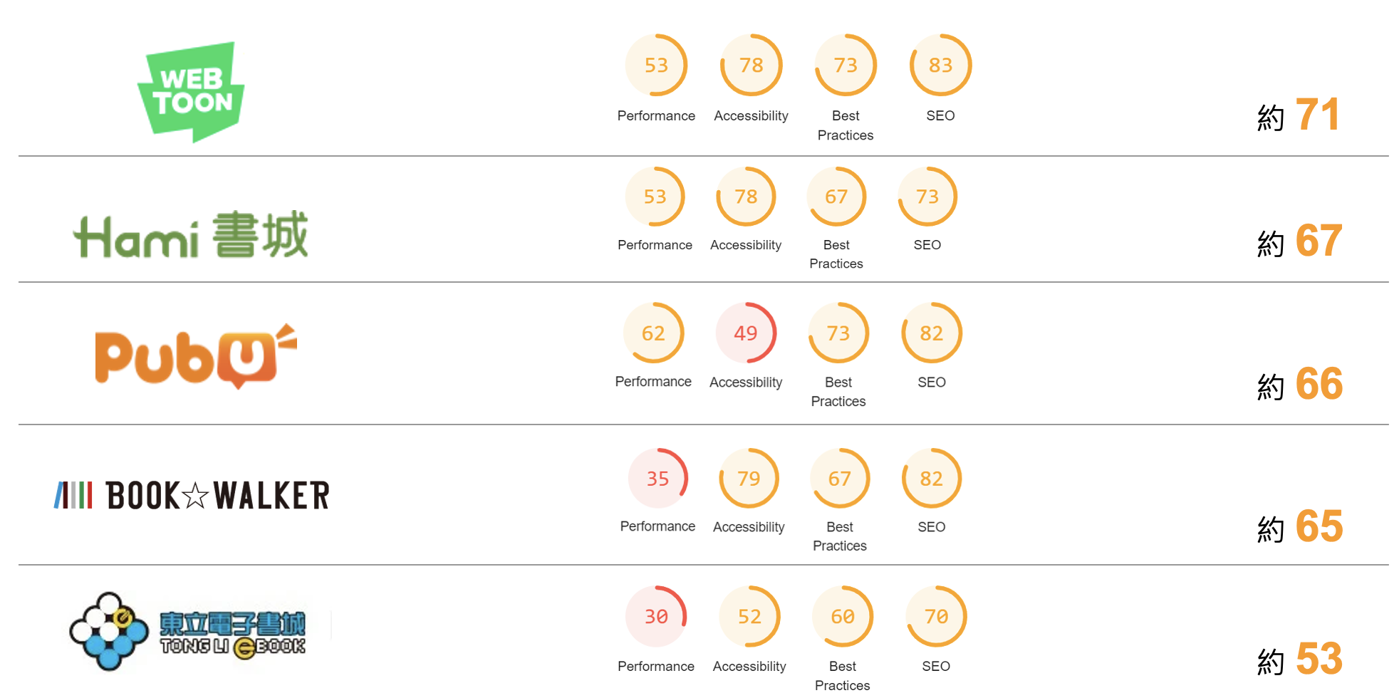
(Year-over-Year Comparison)

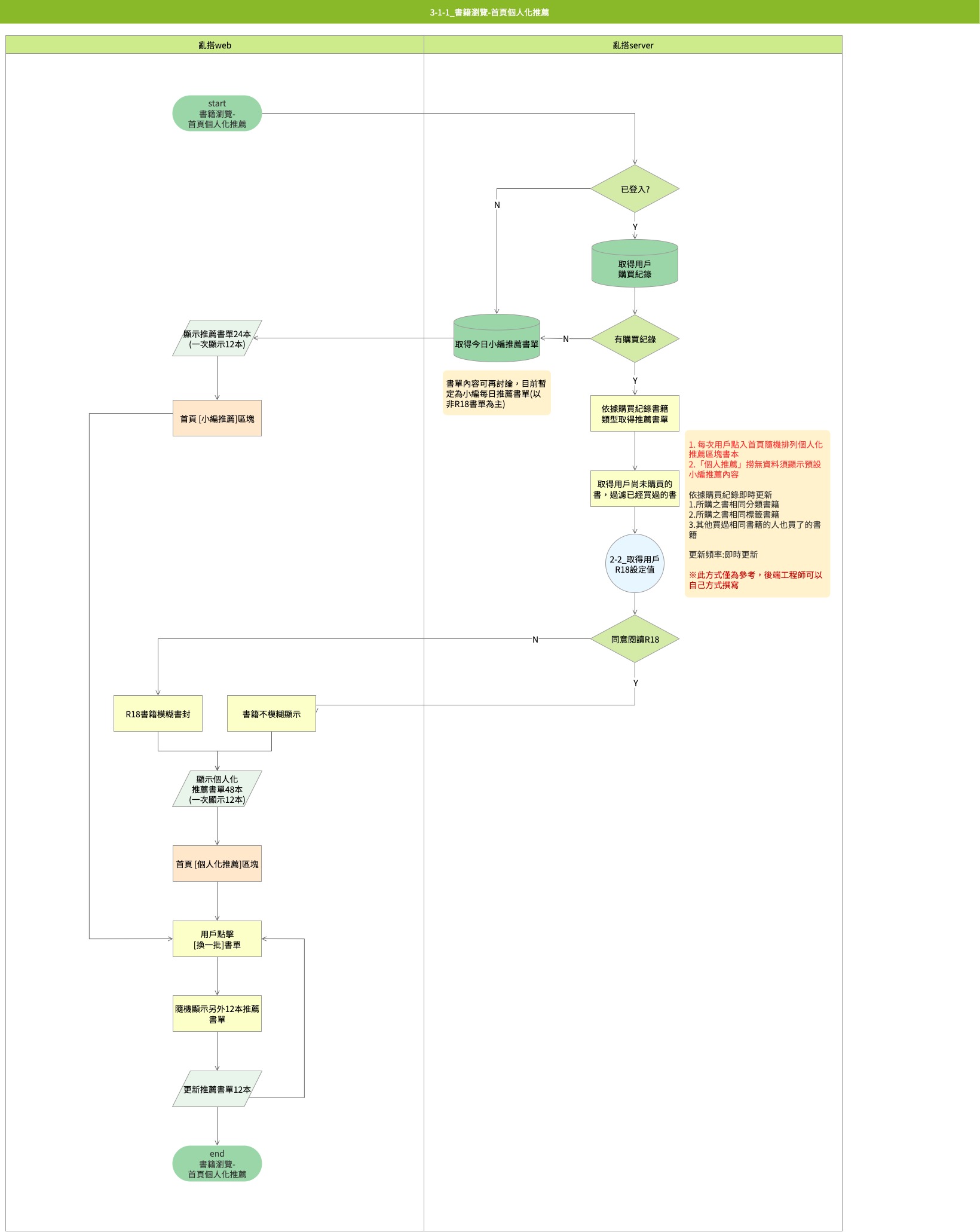
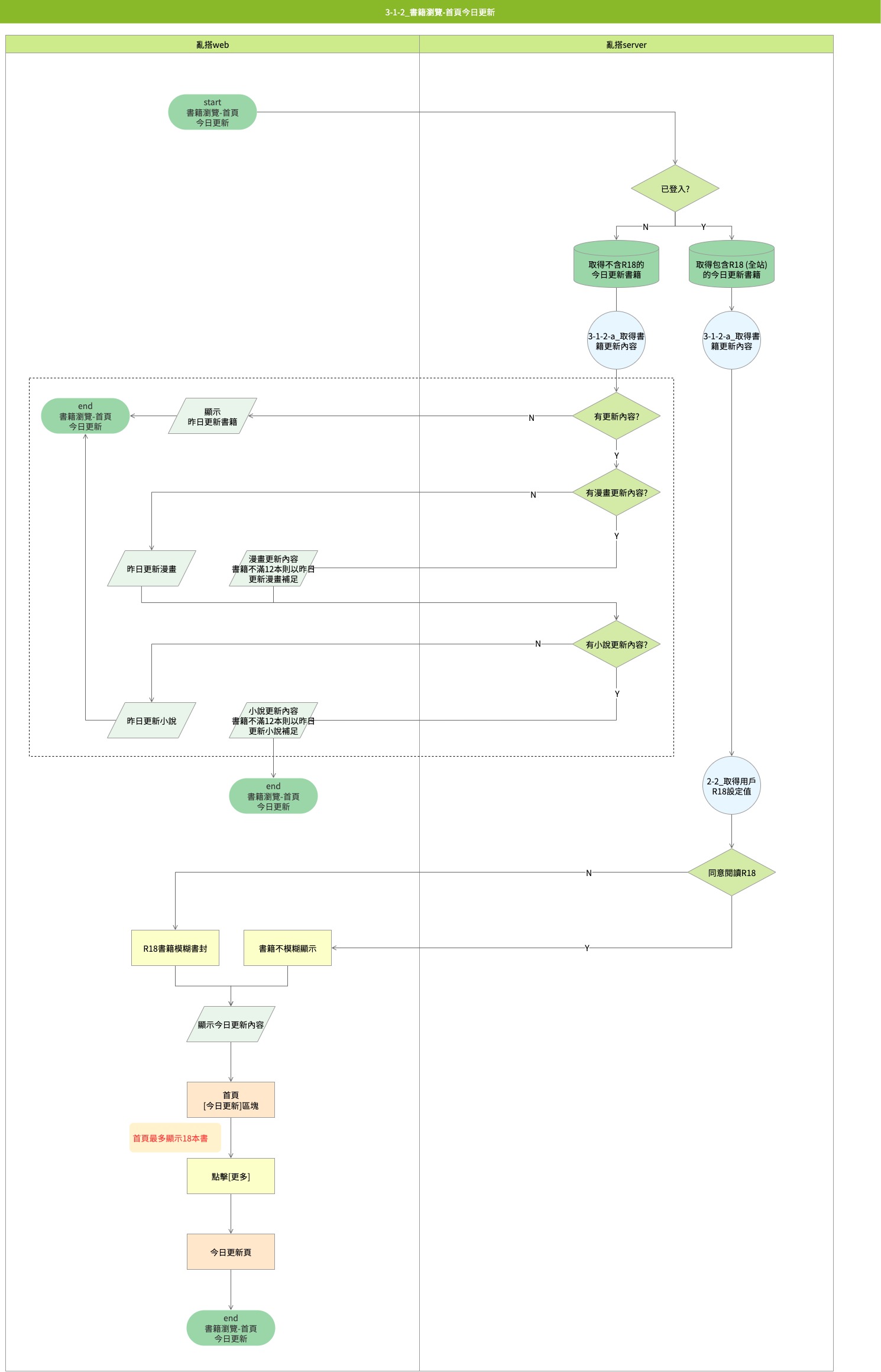
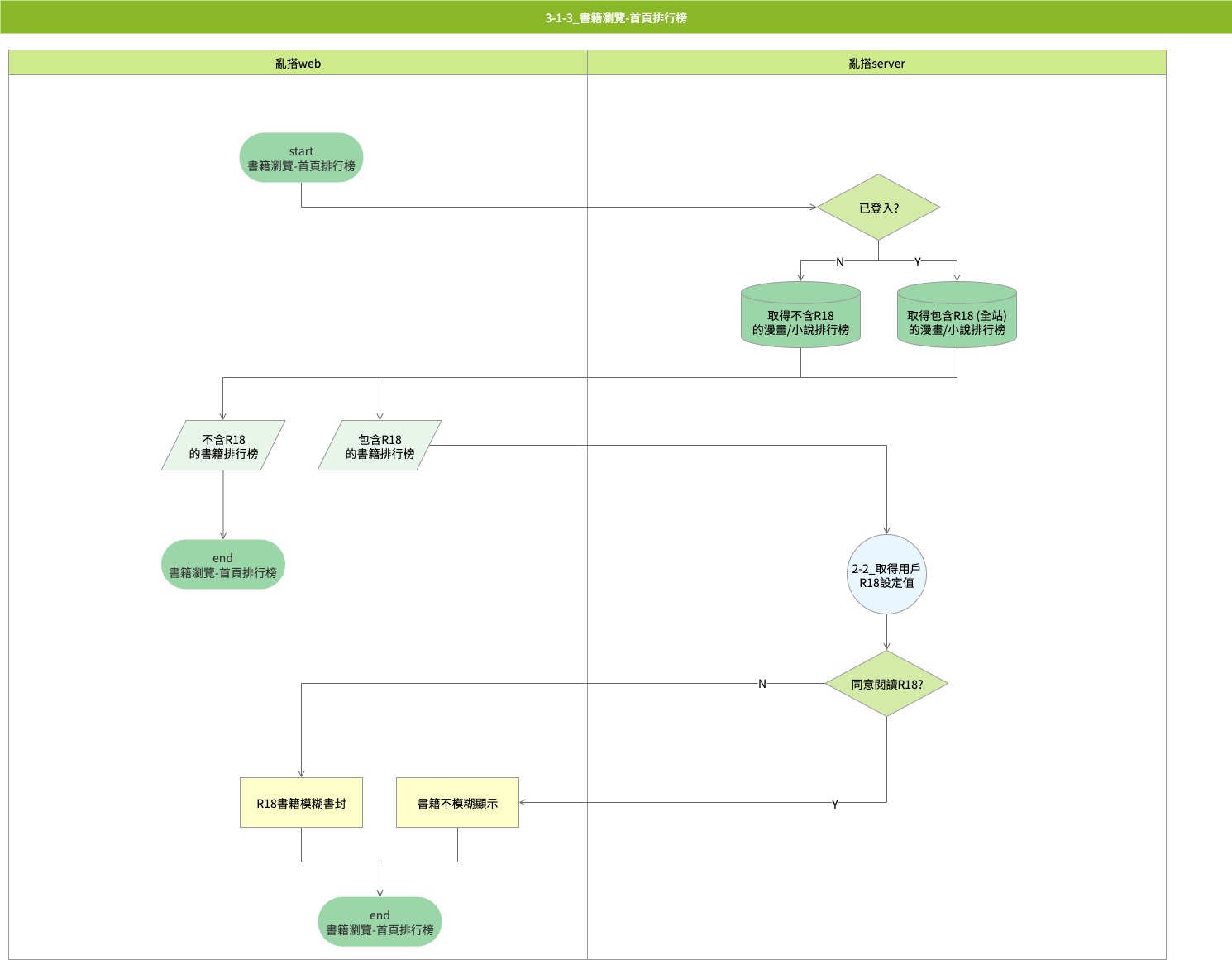
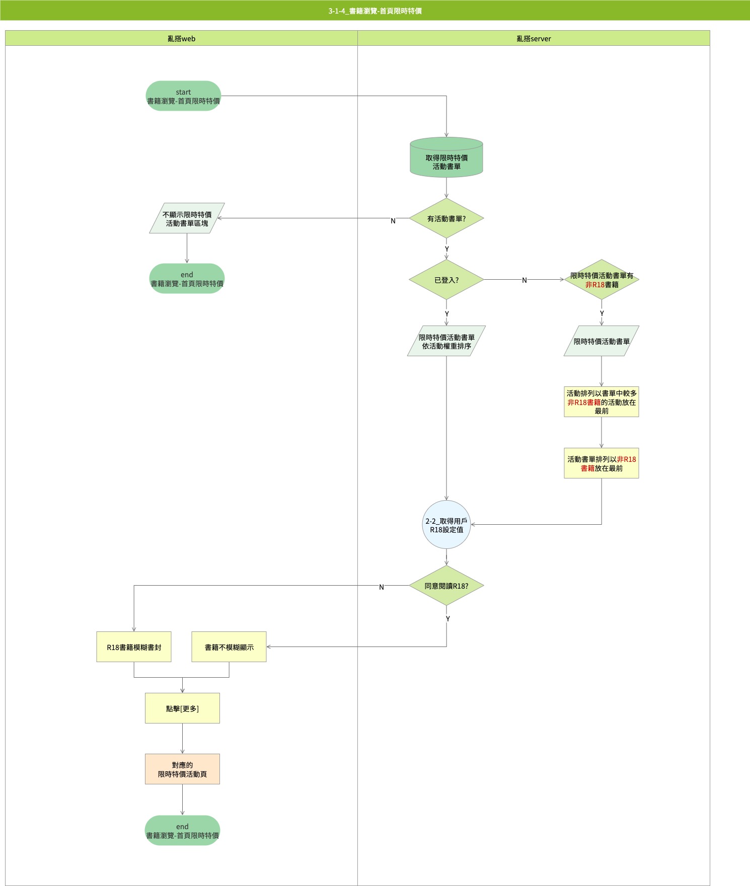
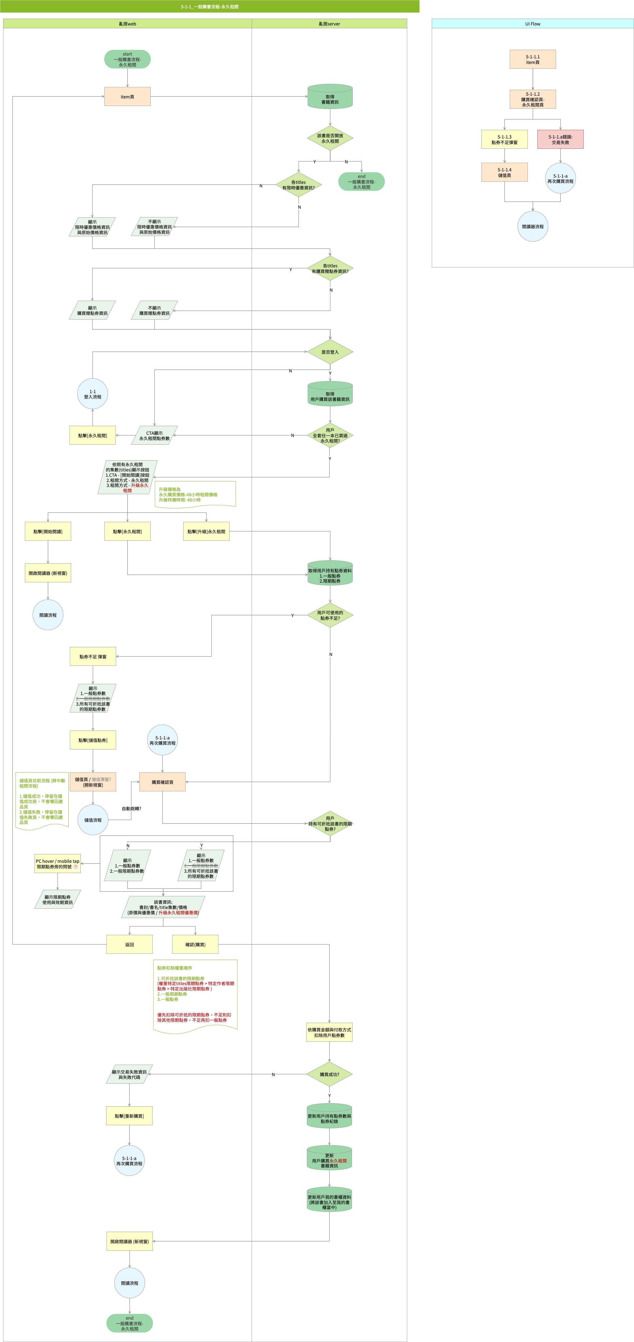
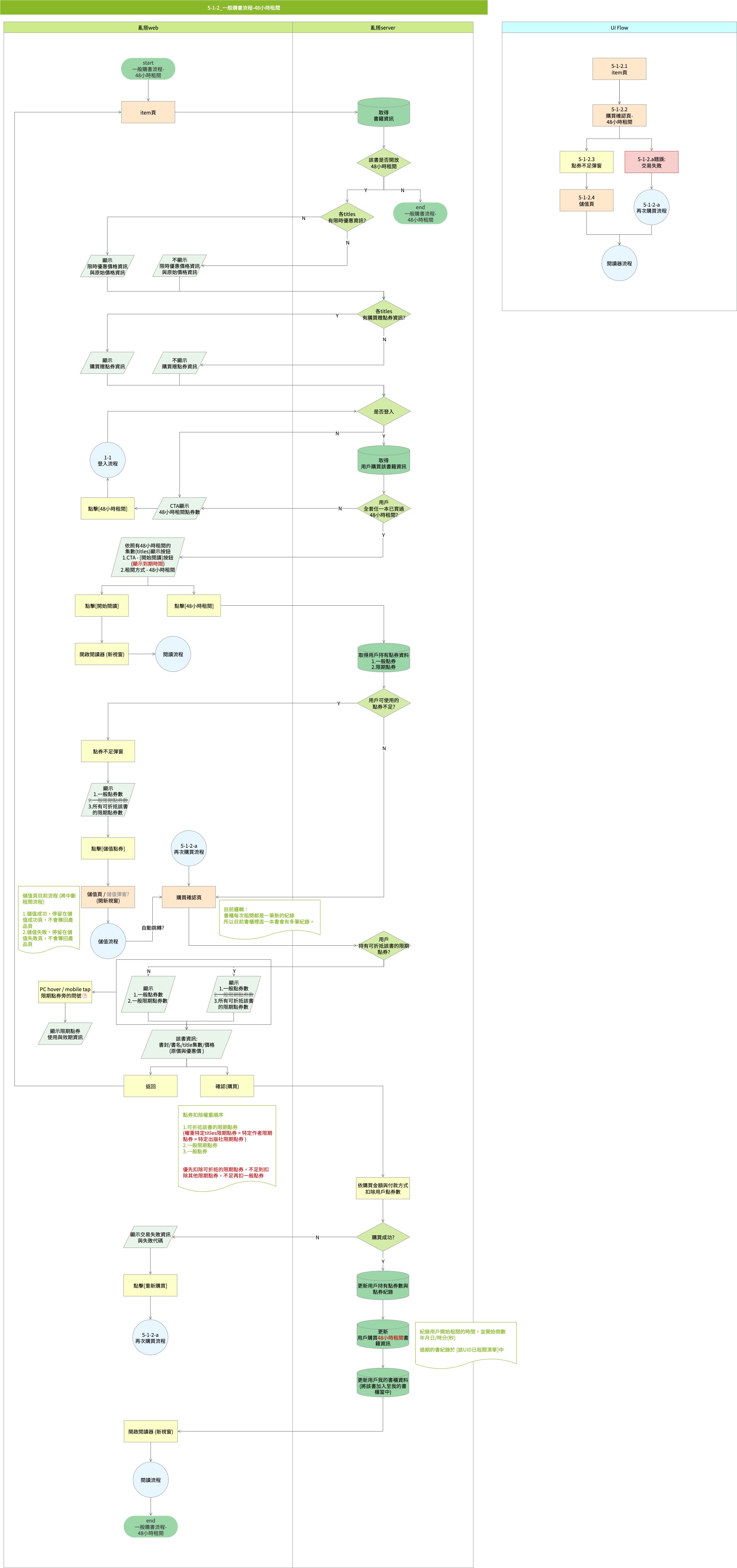
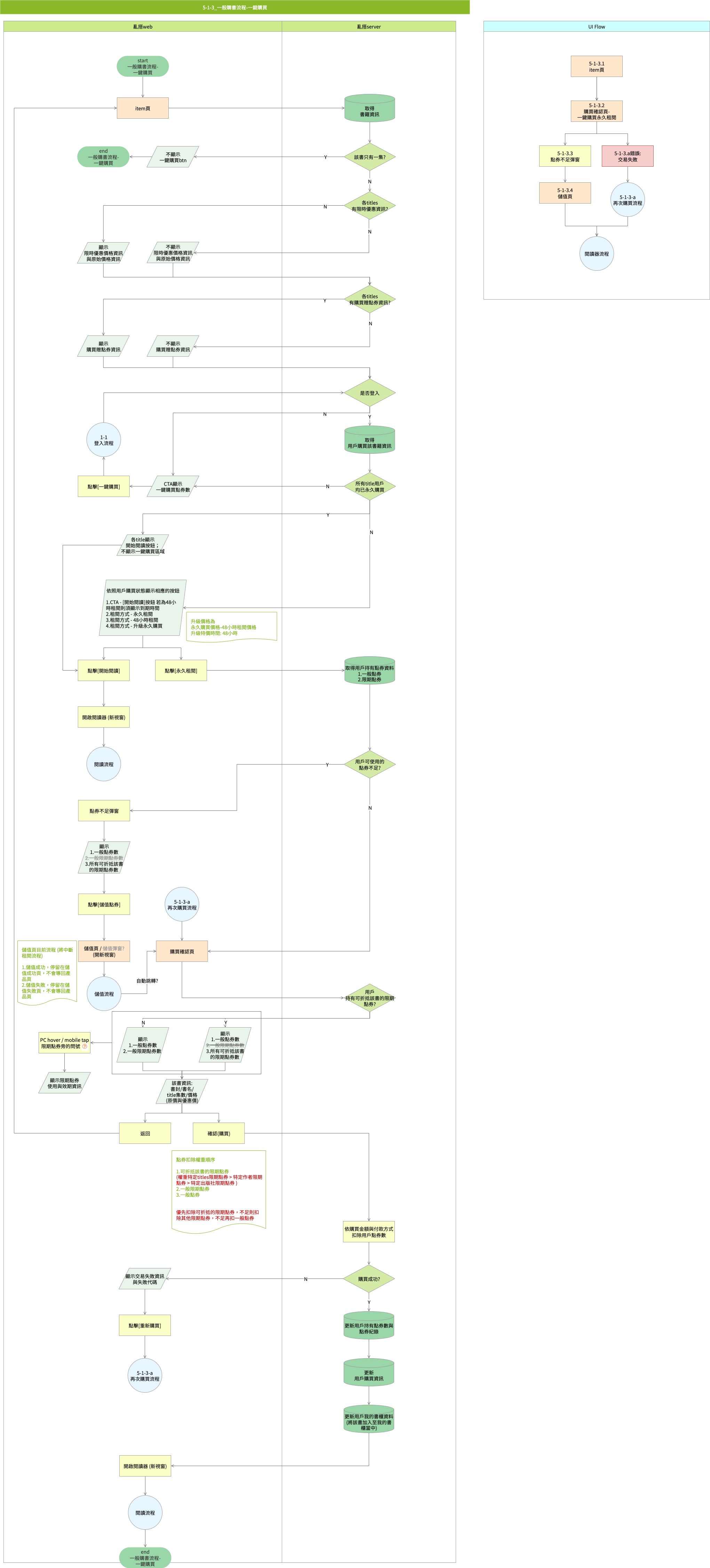
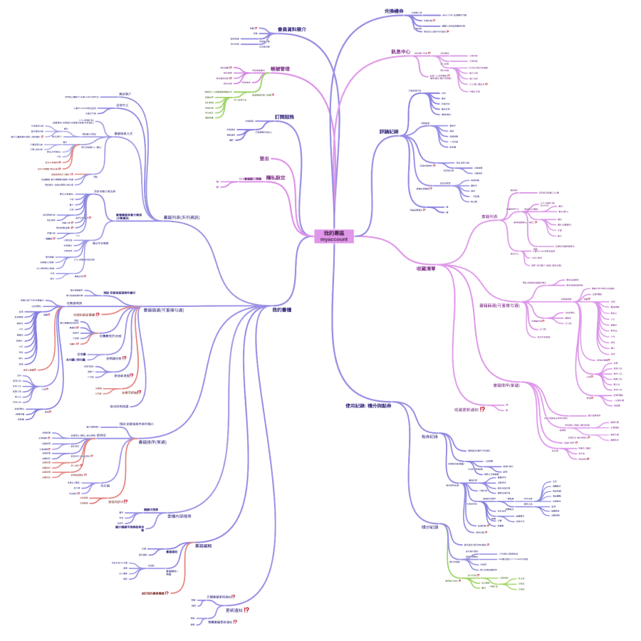
Developed end-to-end flow charts for the site-wide purchase process and the homepage data retrieval flow (or homepage browsing data acquisition process).
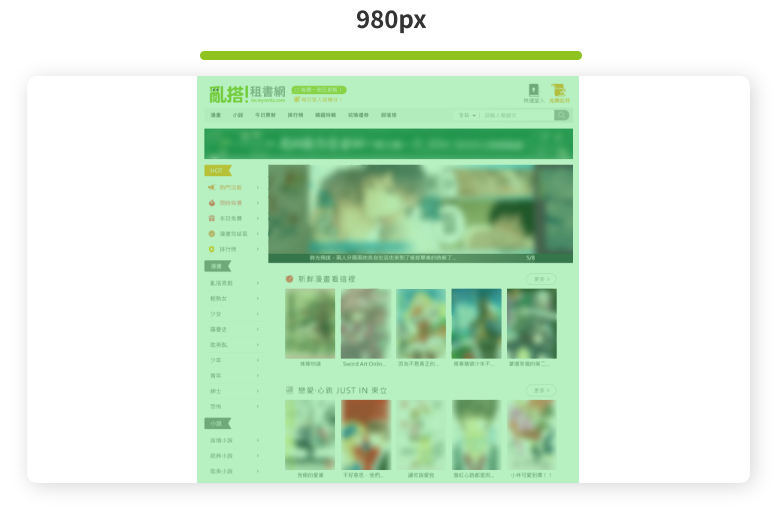
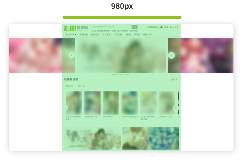
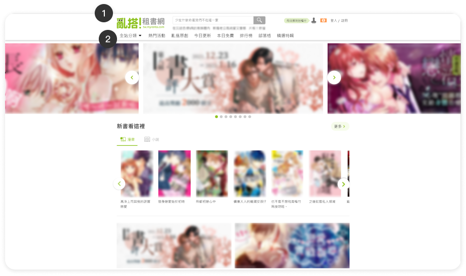
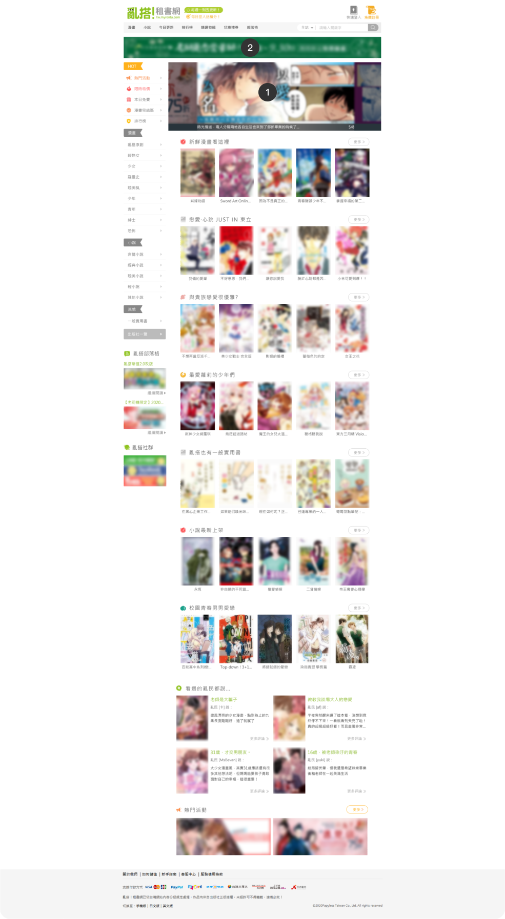
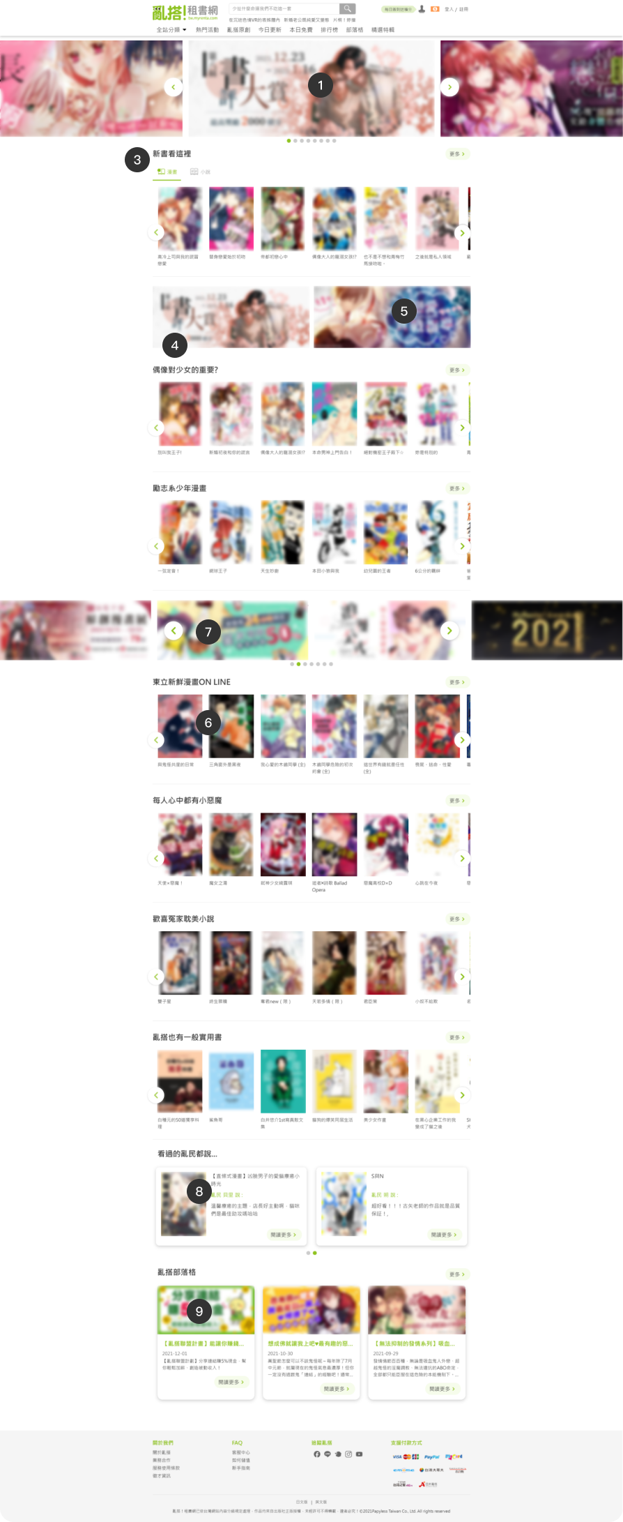
As the redesign is being carried out progressively, not all pages of the website will be redesigned. Therefore, the maximum width of the webpage will remain at 980px, along with the website's breakpoints. Considering the characteristics of the homepage, certain components of the page will be displayed in full width.
To provide users with a diverse marketing model on the website based on the existing business model, improve sales pain points, and offer users more choices.


Under the old website's pricing unit calculation, it was unable to provide users with more favorable discounted prices (1 point = 10 NTD). We plan to revamp the credit system to one decimal place, making product prices equivalent to the Taiwanese currency unit (0.1 point = 1 NTD), providing users with more discount options.
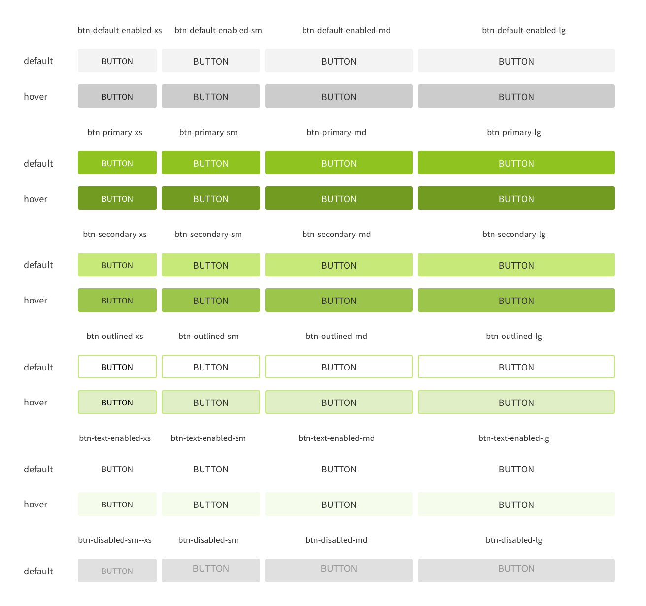
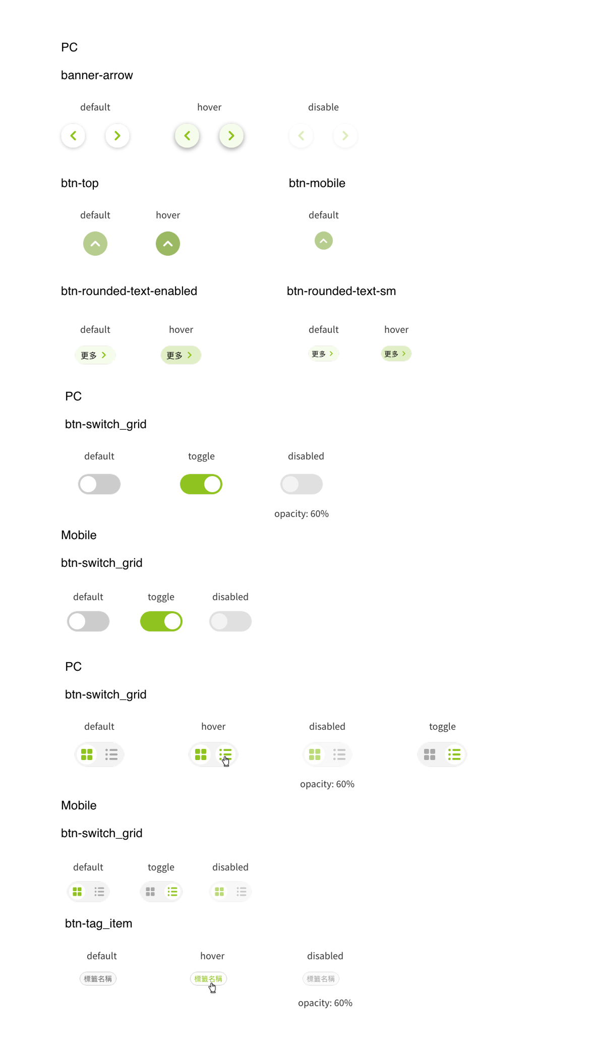
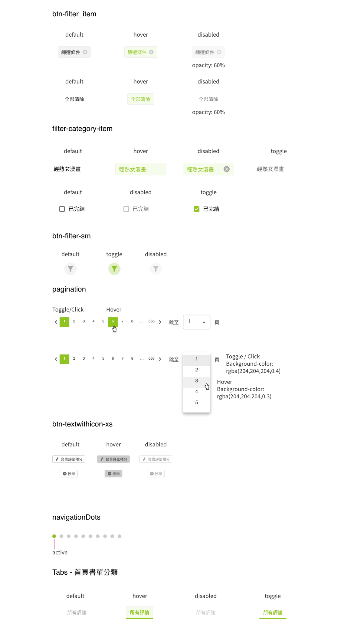
We adjusted button UI, expanded the price area, and iterated adjustments to fonts and color extensions.


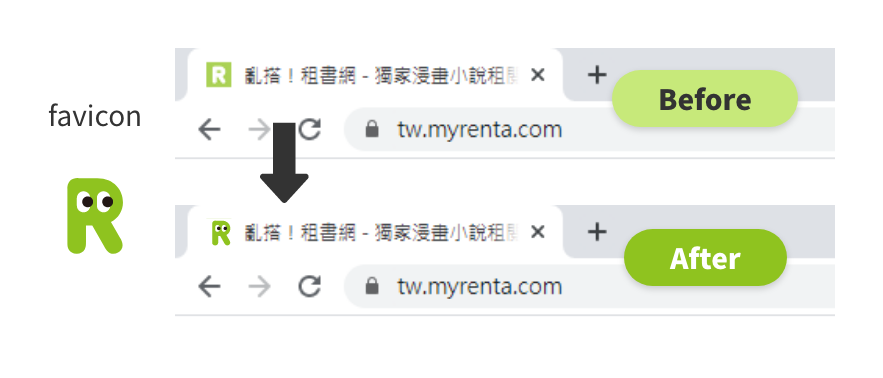
To reflect the same style as the brand logo, the favicon has been changed to match the design of the Japanese site's favicon, thereby maintaining a consistent brand style.


Loading Image Status Using the website logo as the image loading indicator to enhance the brand image.


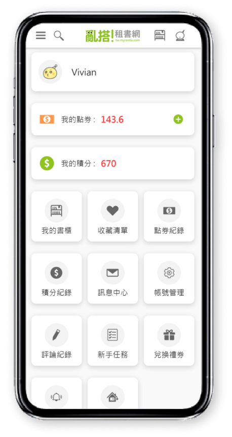
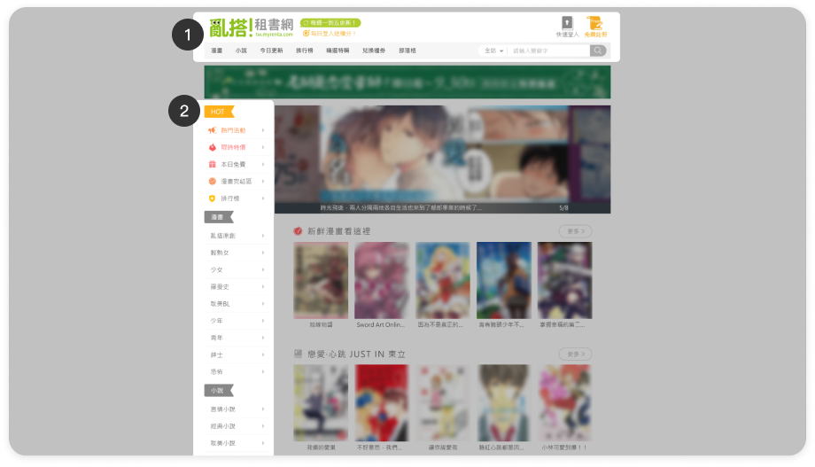
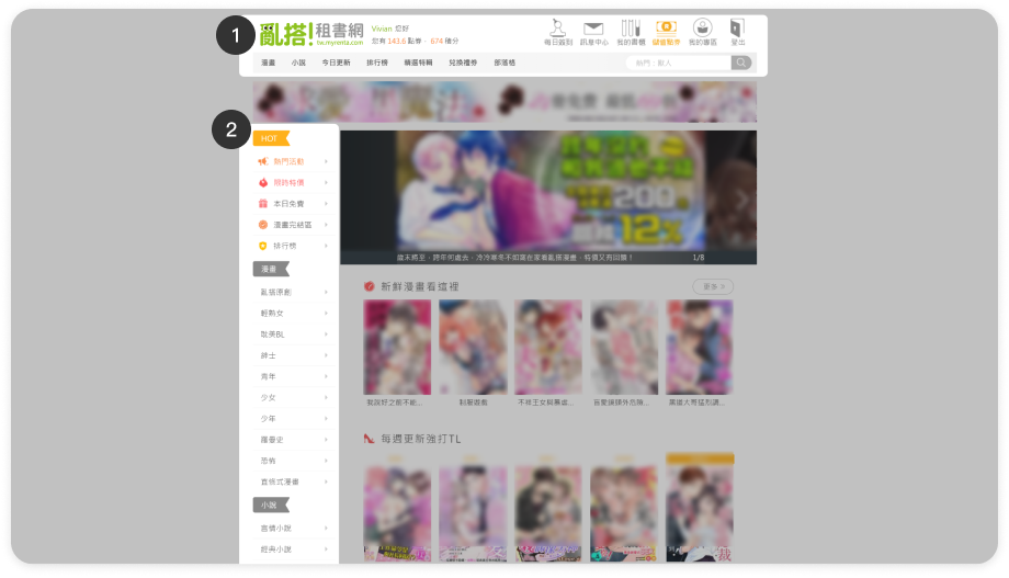
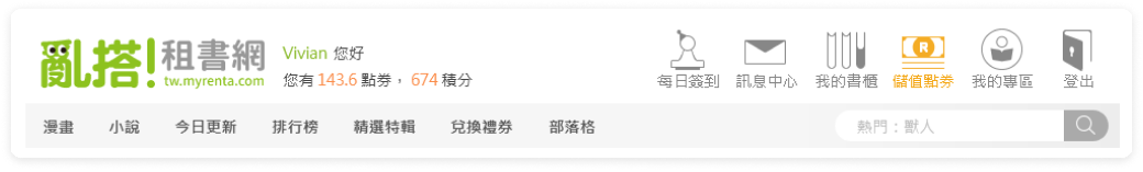
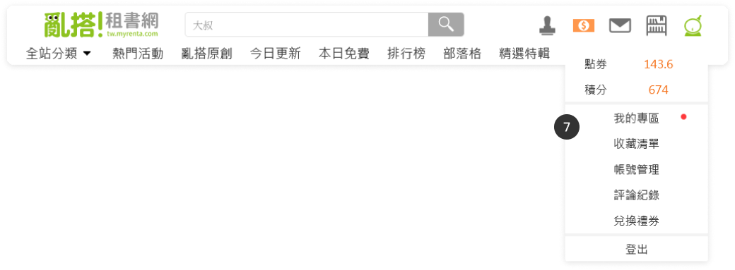
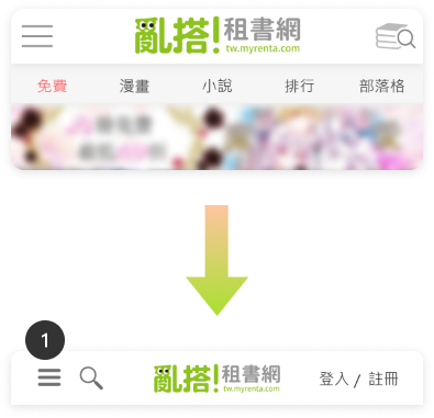
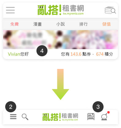
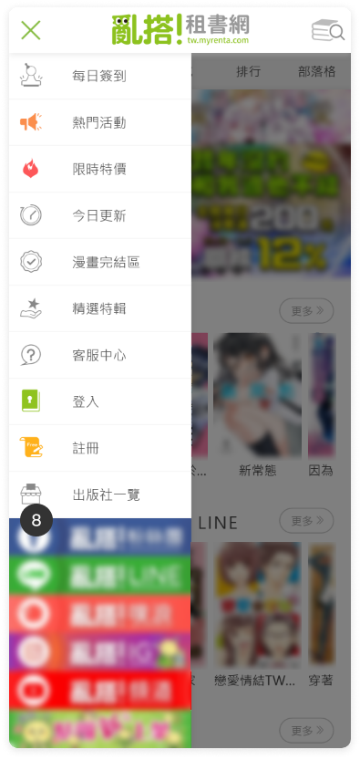
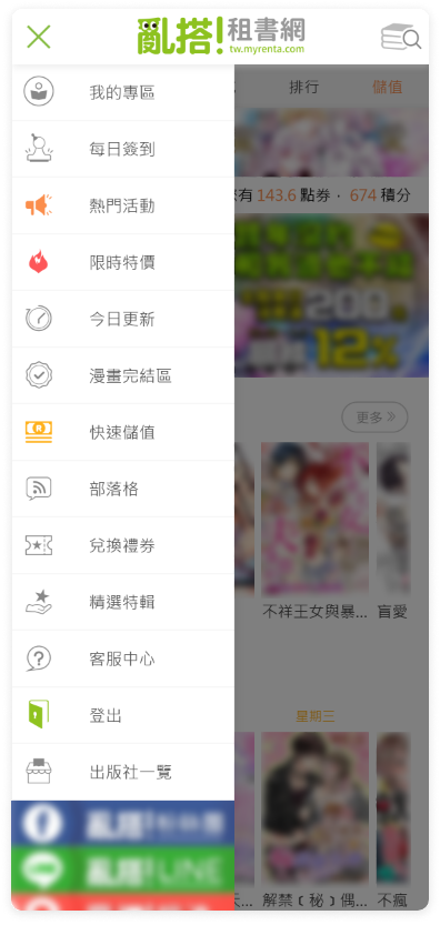
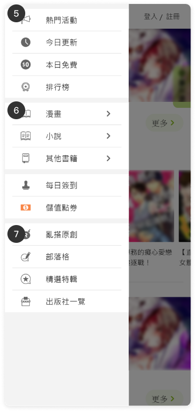
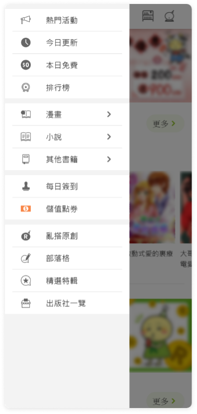
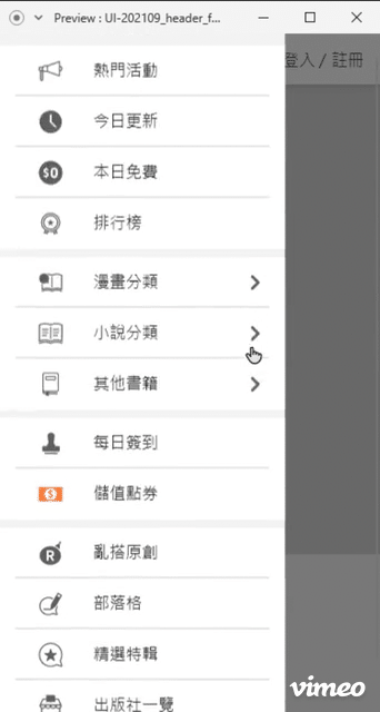
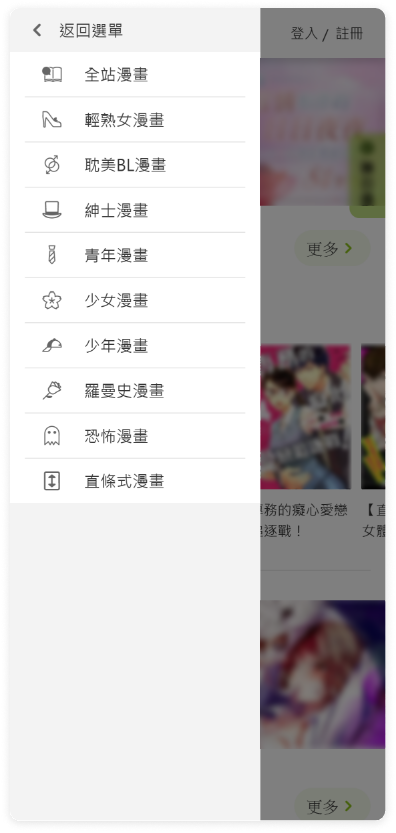
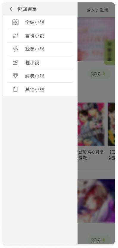
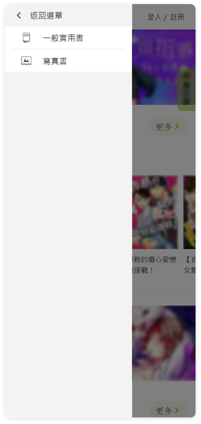
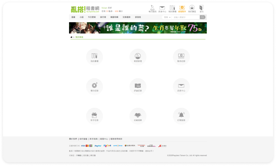
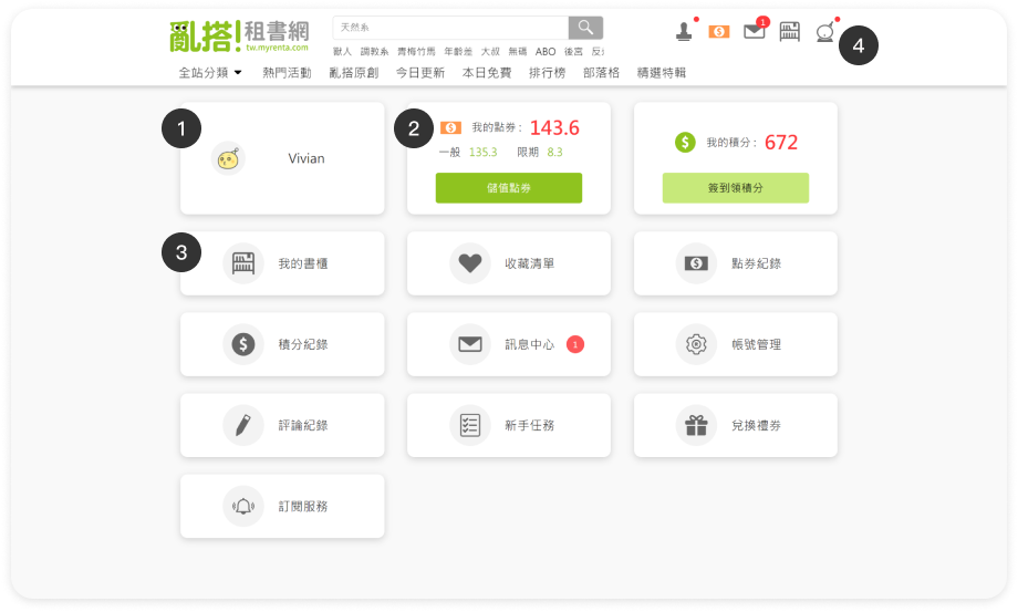
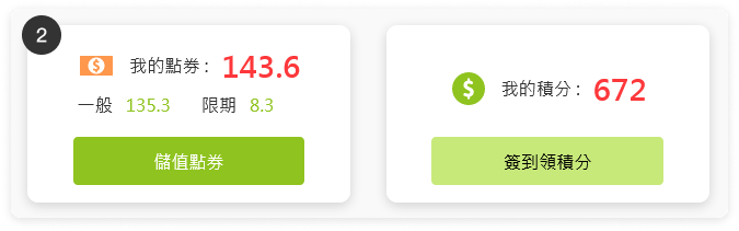
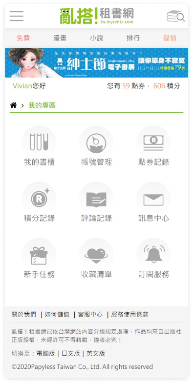
From Google Analytics, querying the subpage traffic ratio under the "Member Area," pages with higher traffic are those more frequently used by users. This is used to adjust the sorting of the Member Area page menu.
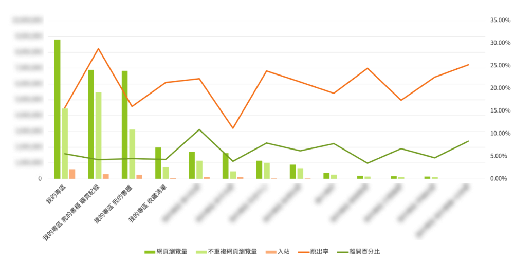
(date statistics are based on cumulative traffic over the past four years)


